Saturday, January 28, 2012

The charm of Ancient Egypt

My art charm group is currently running a swap with ancient Egypt as the theme.  I was intrigued by this idea as soon as I heard it was coming about.  I ran across similar cat beads late last year and immediately knew what I wanted to do for my charms. This idea has literally been rattling around in my brain for months. 

The Egyptian cat God Bast, is a symbol of protection, motherhood and fertility.  Cats were so revered in ancient Egypt, that they were often mummified.  I thought that the wings were a nice symbol for the transition to eternal life.  Plus, I think it just looks cute!  I also love the serious look on the cat's face.


The wings were silver and did not really go with the brass findings required for the project.  To attend to this, I altered them with a rusting product.  I also added an additional patina agent to one side of the wings.  You can see above that some of the charms are showing a bronze side and others have a bit more of an aged patina look.  Another cool aspect of these little guys is the movement.  The wings really spin if you flick them, fun. 


I hope the gals in the swap like them.  I always look forward to seeing the outcome of my art exchanges.  The past few I have participated in have assisted me in embellishing up a few great art projects.  I am grateful for the ability to share my work, while appreciating the work of others.  Stay tuned, I am sure someday I will have a cool project showing off all my ancient goodies.

Cheers! 

Sunday, January 22, 2012

Vintage Valentine

As part of my adoration of Tim Holtz and his product line, I am involved with an online community called All Things Tim.  From time to time there are chunky book swaps to participate in,  I jumped on board with the Vintage Valentine offering.  I am also entering this into this week's challege of "anything but a card," over at Simon Says Stamp and Show.

My pages are 6x6 and mounted on very heavy chipboard.  I used Tim's images from his seasonal paper stash as my focal.  Many other of his goodies were used as well:  antique linen distress stain, his new tissue paper and of course tissue tape.


The backs are adorned with faux postcards I made from some kraft paper.  Some of them actually have burnt edges for interest. 


I also added these cute little faux wax seals as a decorative element on the back.  I learned how to do this from a crafty pal, Angela in her first online tutorial.  Thanks for your inspiration Angela!


Each front layout is a little bit different.  I used a new die cut my mom picked out for me for Christmas on her own, she did great!  I am not sure I would have chosen it on my own, and I absolutely love it. 


Another element you can see on this page are these darling square doilies.  Another crafty pal resource here, thanks Cathwren!  I aged them a bit with a few hits of distress stain. I had a different plan for them, but they were just too pretty to cut up.  Spray adhesive was the secret to a durable page with no pesky loose edges.   


I also used, gasp, stickers!  The hearts were from Martha and have a delicious texture.  They were a bit too pink for me, which I attended to with a little vintage photo ink. 


I had a two different paper selections for the back.  I love the clever use of an old postage stamp and a vintage air mail stamp.  I just adore all things postal!  I am also very grateful for the inspiration this little group provides me. 

Thanks ATT!

Cheers,

Rhea


Thursday, January 19, 2012

Farstarr's Mail Art Journal

Quite some time ago I started a round robin journal with a small private group on Swapbot.  It did not go as planned, but at least I finally got my book back.  For that I am grateful.  I have not sent it back out to have the other seven people work in it, because I am afraid it will not return.  I am, however, keeping up on my end of the deal and working in others books.  Since my journal is mail art themed, I have offered participants to send me a bit of mail art for me to add to my book tip in style. 

This book comes from Mandy, aka, Farstarr.  She and I have been swapping mail art in some form for a while now.  She has a love for fish and science as well as all things postal and vintage.  I think the book she altered is actually a moleskine.  It is getting really fat and full of character already.  I hope she does not mind...I added a bunch as you will see!


The cover and inside few pages were created by the owner of the journal.  I love Mandy's use of vintage ephemera and stamps.  I could not resist adding this German scrap fish to the front.  I am hopeful she does not mind that I added this here. 


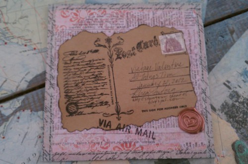
I got a little carried away on the inside cover too.  I had some stickers that I thought would go really well with her journal, so they found their way on the page too.  Each page I worked on has an imprint of a vintage Via Air Mail stamp.  I thought this was a clever way to "sign" the page, without being obnoxious. 


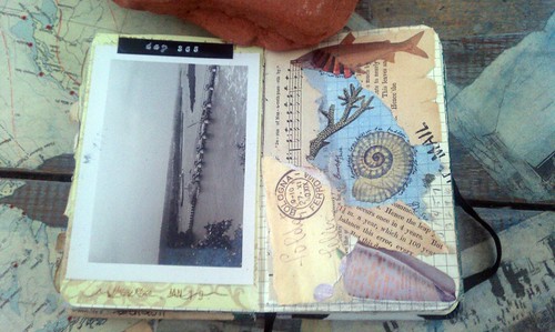
This is the first spread I did.  It was quick and easy to do since Mandy sent along an envie of dreamy ephemera with her book.  I did find though that the pages I did with her stuff look very similar to the other entries, so I later ventured into my own stash to switch it up.


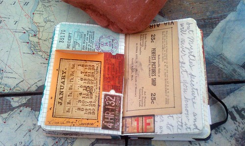
I just had to use the vintage picture that was in the ephemera envelope.  I love the look of an old photo.  A simple label was added to the top of the page, I titled it "day 365."  Hopefully the owner appreciates this nod to her Mail Art 365 project. 


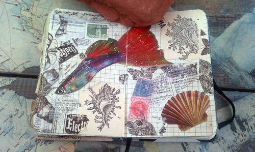
This page is filled with simple collage and scraps from my work table.  The guppy was in Mandy's stash, and I added a cute title after taking the picture.  It will just have to be a surprise for the owner.


This page also had a few additions post photos due to composition issues.  It was too dark to retake them when I realized this.  Bring on the longer days for better blogging!  Anyhow, I also decided to cover up the surfer, as the owner of this book really does not like people in her art.  Don't worry Mandy, the surfer is gone!


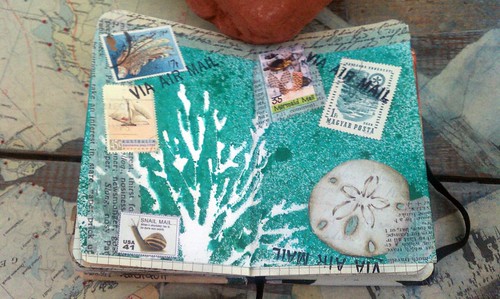
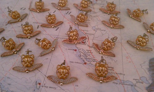
This background was left over from one of my first swaps on the bot.  I thought it was a nice addition to the book, something different.  I also added a few scraps, some used stamps as well as some artistamps I had in my stash. 


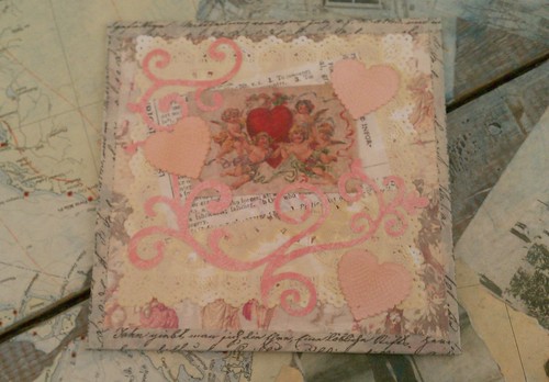
And here is my final spread.  This layout is much different than my usual style.  I embraced the straight lines for once.  Here I used an old letter, some vintage ephemera from my own stash as well as a few of Tim's salvage stickers to finish the page.  I love the small envelope glued on the page.  I enjoy having interaction in my work if I can add it.

Since this week's challenge over at Simon Says Stamp and Show is to show off "anything besides a card," I am going to link it up.

I hope you enjoyed seeing inside of this wonderful compilation of mail art!

Cheers, 

Rhea 

Bead Soup Teaser

I was lucky enough to be selected in the lottery for this installation of the Bead Soup Blog Party.  This is hosted a few times a year by Lori Anderson.  As the hostess, she connects fellow bloggers and jewelry artists and we exchange "bead soup."  This consists of a quality packet of beads which has to include a focal, a special clasp and some complementary beads.  Participants are challenged to use at least the clasp and focal in a project.  Then we all post on the party day check out each other's work.  I have done this once before, and I really enjoyed the process. 

My partner this round is Cory Celaya.  I am really excited, as her style is quite different than mine. Her work is absolutely lovely.  She has a real boho/tribal/gypsy style, from what I can gather.  Hopefully this connection with a different genre of work is inspirational for both of us.

We are allowed to post teasers of what we send prior to our partners getting the beads.  Here is a sneaky peek of what Cory has coming to her.


I will post a full reveal once she gets her beads and I receive mine.  Thanks for following along!

Cheers, 

Rhea 

Friday, January 13, 2012

A little more love

I am still turning out a few Valentine's Day pieces.  It is funny to me how much I have gotten into the holiday themes since really getting into mixed media.  I was never one to really embrace holidays previously. I love how there are different flavors and sources of inspiration for each of the different days. 

These both fit into the theme over at Simon Says Stamp and Show.  I am bound and determined to either win a gift certificate, or nudge my way onto their design team over there so I can get more crafty supplies!  The theme this week is a "red letter day," so these little signs fit the bill since Valentines Day was my inspiration. 


These were very simple to create.  I used several of Tim Holtz's dies to get my shapes.  Most of the coloring was done with distress stains, have I told you how much I love these...amazing!  I did add a bit of wire, stickels, rub and buff and a few eyelets to give the project the mixed media feel I was after.


I extended the above project off the chipboard base by adding eyelets and attaching a piece of grunge board with jump rings.  It also adds movement to the piece, and I love movement in  my work. 

Hopefully this post inspires you to use some of those die cuts you have laying around!

Cheers,

Rhea

Wednesday, January 11, 2012

Day of the Dead Shrine

This project has actually been in the works for quite some time.  Loyal followers may recall that a few months ago I did a charm swap with a Day of the Dead theme.  In doing this swap I found a love and respect for this genre of art.  I had received so many awesome charms from my fellow charm lovers and had no idea what I was going to do with them.  This is what I finally came up with and I am pretty happy with the results.

The theme over at Simon Says Stamp and Show this week is a "red letter day." I think Day of the Dead is a very clever take on a red letter day indeed. I love the imagery and art associated with this day of remembrance.


I actually made the inner shrine some time ago as well.  It is made from Masonite and it comes from a wonderful company called Coffee Break Design.  You can also purchase their line of goods from Alpha Stamps.  I simply used stickels to color the shrine and then I added in an extra altered skull I had from making my charms for our swap.  As you may be able to see, I did not get the best results "filling" in my niche with Glossy Accents.  Even though I let it dry and added more material several times, I still ended up with a very inconsistent "resin" type background.  Oh well! 

It was difficult to get good pictures of this piece as I decided to use the acetate that came with this small configurations box from Tim Holtz to "seal" in my shrine.  Because of my artistic choice, I could not get a good picture without a glare.  In the picture above I was trying to get a little closer so that you can see some of the the clever work from a few of my fellow Art Charmers. 


I did do a few things to create depth in this piece.  I added some charms from the top of the box for movement, I mounted my "inner shrine" on a wood block so that it would not sit flush with the back of the box and I also did that with some of the other charms. 


The outside of the box is covered in Tim's new tissue paper from his District Market line.  I LOVE this stuff!  I was daunted by the price tag at first, but I will say, this is a worthy crafty investment.  It was aged with Tim's distress stains in black soot and antique linen...the stains are amazing too.  I resisted investing in them for a while, but it is pointless...the product is amazing.  

I hope you enjoyed seeing this artistic collaboration with my charming friends.  Thanks for stopping by as always!

Cheers, 

Rhea 

Sunday, January 8, 2012

The mechanics of love

As some of you may have noticed, I recently made some Valentine's Day themed items. As I was creating them, my muse struck in major way. I literally stopped my project in motion to make this little guy, even knowing the name of blog post as I crafted away. 

The thought was to make a fortune teller.  After all, most people want to know about love and relationships when seeking esoteric advisement, and the season of love is upon us.  Well, I started out with the intention to try and keep it a bit more feminine and frilly.  As you can see the first one did not come out that way, my love for steampunk took over.  I could not believe I found this key with the heart in my stash, talk about a perfect score.  I was also surprised at the little pair of angels I located. 


This project is worthy of the theme this week over at Simon Says Stamp and Show, is for something old and something new.  The old here is represented in the vintage key and clock gear. The new is the distress stains.  I received a bunch more colors for Christmas, and I am addicted.  It is right up there with my tissue tape addiction. 

I am off to make a few more of these for a little local shop.  I will hop back on and add a few more photos when I get them done.  I think this idea would translate well for you card makers out there too. 

Cheers,

Rhea


Saturday, January 7, 2012

Bunting Love

I have wanted to make one of these trendy little buntings for a while.  I took inspiration from the upcoming season of Love, Valentine's Day. 


I had to do some problem solving to get everything to hang right.  I had a few versions of this before I ever added the pennants that were unsuccessful.  I love the use of eyelets, jump rings and simple twine for hanging. 


On this set the backing is a tag from Martha Stewart.  I wish I picked up more of these when I was recently at a discount store, as they fit perfectly behind the rosettes.  I also did something unusual for me, I kept it simple!

I am sending these off to a little shop, where hopefully they will find a new home.

Cheers,

Rhea

Monday, January 2, 2012

Art Journaling

I have started the new free Strathmore online workshop with gusto.  Let's just hope I can keep up with it!  I have never done such an online course, so I am excited to explore a new way of learning and interacting with the art community.  Seems to be a running theme right now with me!

Anyway, I decided to share my first painting.  I guess that is what you would call it.  I did not have much of what was needed for the class, but I vowed to work from my stash instead of running out and getting more stuff.


I took many ideas and principals from the video, but used many different mediums.  For instance I used water based paints and stains to start out.  I also used my new Pan Pastels, which are what gives this piece it's hazy appearance and unites the look.  You can't really tell in the photos, but I used a lot of items that are glittery.  I had picked up some glitter markers from Martha Stewart that I used, Glimmer Mists add a sparkle as did a silver leafing pen.  I loved the teacher's idea of using a correction marker from the office supply store. While I did not have one on hand, I improvised a bit with a Sharpie Poster Paint Pen. 

Thanks for stopping by.  I am looking forward to sharing more artful doodling!

Cheers,

Rhea

Sunday, January 1, 2012

Junque Book: Video Tour

So I have found these little videos to be a fun way to interact with my readers.  Surprise, surprise because I hate to be on camera.  For some reason, I feel okay behind the scenes and I am going with it. 

I decided to post a video clip showing off the inside of my very chunky Christmas Junque Journal.   Sometimes it is hard to capture the true feel of a piece in a blog entry with just photos and words. This way, readers can hear the wonderful little jingle of the bells, learn about some of the secret bits of junk and hopefully get a little inspiration to save or repurpose something for your own art journal. 

You can read more about my first junque book journey here.  I liked that one so much I had to make my own, which is detailed here.   There were so many comments, inquiries and such overall positive feedback about this project that I also did a tutorial here.  Hopefully you have enjoyed sharing my journey, I know I have found joy in sharing it!


Thanks for stopping by today and always.  I appreciate my readers so very much.  Happy New Year to each and every one of you, may 2012 bring you your soul's desire!

Cheers,

Rhea

P.S. Nails done with Sally Hansen Salon Effects: Misbehaved.  LOVE this product!