Showing posts with label art journal. Show all posts

Sunday, October 11, 2015

Magical Woman


This is admittedly quite different for me!  I do not usually use people in my art, let alone try to draw them.  After a few You Tube videos on "how to draw" a few different things, I set out to create my journal page for a round robin I am in locally.  The theme of this book is Magical Women.


Since I am not present at the meetings to share my techniques, I thought I would write about a few things I did here.  It feels good to dust off the old blog!  To start out this page I added a layer of Tim Holt's tissue paper with soft gloss gel.  I then followed with a thin coat of white gesso.


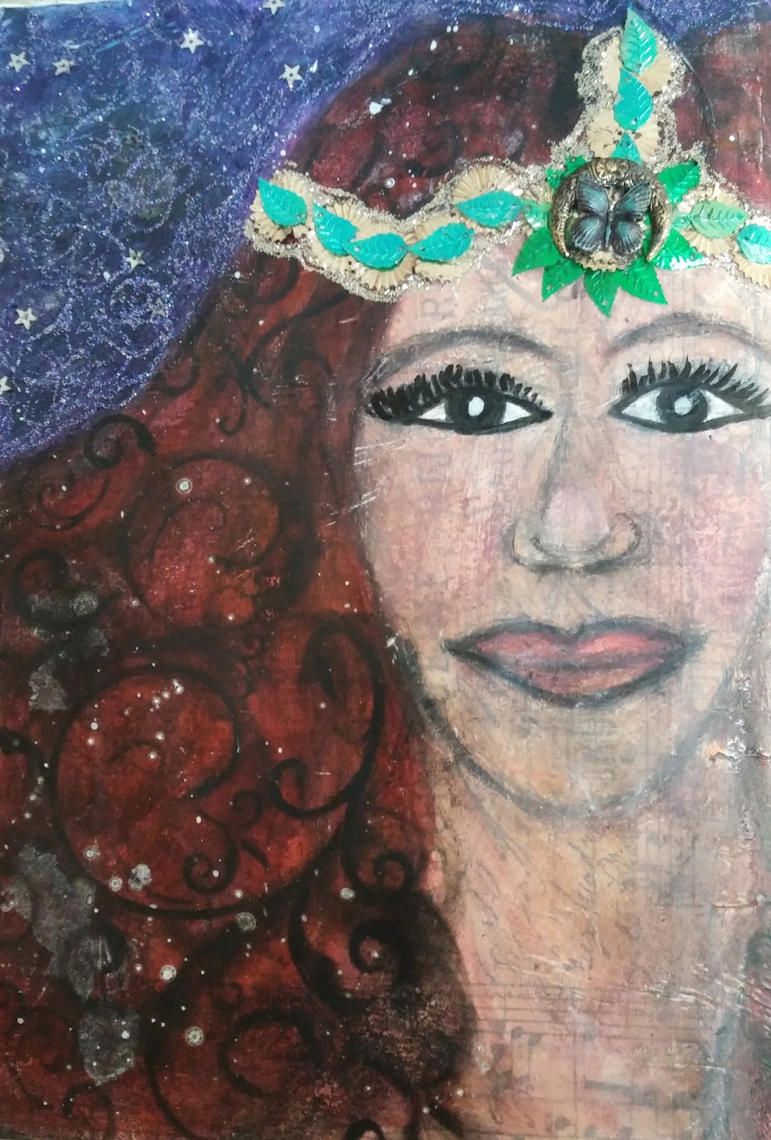
Next came sketching with pencil while watching many videos.  I had to just make peace with some elements I was not happy with.  I then started to add some flesh color and hair lines with oil pastels. Pitt pens, brush markers and whatever was in my art journal tackle box added lots of elements to this mixed media spread.


To get the stencil pattern on the hair I used Pan Pastel in black, it added a great texture.  The purple/blue background started off with some acrylic paint, but also ended up with oil pastels and gelatos before I was happy with the shade.  I used a fixative before adding in my stickel swirls, and glued on sequins.  There was a bit of flicking done with a white paint pen as well somewhere in the process.


My magical women was inspired by "The Mists of Avalon," one of my favorite books with strong magical women.  Those that resided on the isle were marked by crescent moons on their foreheads.  I am hopeful the recipient likes my entry in her magical book!

Cheers,

Rhea

Saturday, March 14, 2015

Tangled Journal Page


This project was completed for Canvas Corp and their recent Tangled challenge.


My focal here is from the Journey Tangled Pack and it was really easy to create.  I layered on lots of products, including some Tattered Angels S.W.A.K. mist, to give it a mixed media feel.  I was sure to add some of my own doodles and marks to make my page unique to me. 


The sentiment was taken from the new Gypsy Moments paper.  I love how the ink bled through the words making them blend into the background a little bit.


I also challenged myself to use some craft supplies that had been neglected.  It is my goal in 2015 to use up the good stuff!  To that end I used some butterfly rub ons as well as the paper flower borders which had been lying around forever.

I hope this post inspires you to use some of those old supplies as well.

Cheers,

Rhea


Friday, February 27, 2015

Dream Tag Banner


Somehow this little project for Graphic 45 got lost in the mix!


I made this right before the new year and I incorporated some secret journaling about my dreams and goals for the year.


One thing I wanted to symbolize in this project, was being free to use my "good" art supplies.  I tend to hang on to the really special stuff...so for this project I used a few coveted scraps of the retired Steampunk Debutante collection. 


This is my absolute favorite from Graphic 45 and I dream of them releasing it again in one of their collectors editions. 


The hinges on this project really help to add heft and weight to the project.  I just love metal embellishments.  The filigrees on the top also frame things out nicely. 


Another item I used that I had on hand were old embossed and gessoed gears that I had die cut.  I am always so happy when something I have been hanging onto finds it's proper home!


The project is double sided.  On the "back" of the tag banner I started off by journaling.


In order to keep my thoughts and dreams private, I decided to add some elements.  This way the meaning that I established is still present, but they are secret.


I used lots of spray inks and layers to achieve interest and texture.


And here are photos of the whole front and back!


I hope you enjoyed this unique way to journal!

Cheers!

Rhea

Tuesday, January 7, 2014

Jumping In with Journal52: Week One


I am happy to be starting 2014 off with a few new art adventures.  The first is Journal52, which is a weekly online art prompt and the second is called Creative Jumpstart 2014.  So with the first creative prompt of "up, up and away" and with some inspiration from "jumping," I created my first journal spread of 2014.


I used a journal I had on hand.  In order to keep the book sturdy I plan to reinforce each page with tape.  I think it will end up pretty thick as things progress.  The tape shown here is hot new product from Graphic 45.  I am absolutely in love with it.


I tried to get the texture thing going on this page with layers of ink, molding paste by Liquitex, distress stain, stickels and a few drips of alcohol inks.  I also buffed on some gilders paste, edged my pages with stain and used pencil to make marks and scribble.


The circles were from prints I made on a friends gelli plate a few weekends ago.  I was happy to put one of my freshly made images to use in my journal.  Lots of details and marks were added with markers, paint pens and even water.  I love playing with the distress stains, you can achieve some great texture with this product since it interacts with water.  Here is where I used Natalie's prompts from Creative Jumpstart, using household items to make my marks.


My goal in this book is to actually journal!  This is a tough one for me...one.  Not only do I have to be open to commit words to a page, I have to scribble my handwriting all over the page, which while it may seem simple, for me it is a daunting task.  

Let's see if I can keep this momentum grooving!

Cheers, 

Rhea


Saturday, June 22, 2013

Moroccan Doors


This is yet another installment of the most wonderful round robin through my Kindred Souls group.  The theme for Pam's book is ornate doors.  You should see the construction of her journal, she really inspired me!


I had some of the brand new Bohemian Bazaar paper and stickers by Graphic 45  on my work table, so these quickly became my starting point.


I just love the rich color and vibrant pattern.  I tried to hinge these doors several ways, unsuccessfully.  In order to be able to still peek inside, the problem was solved by showcasing them slightly open.


On the back I used a bit of watered down Peacock Feathers Distress stain to add watery interest.  

I hope Pam enjoys the contribution I made for her most amazing journal.

Cheers, 

Rhea


Wednesday, May 29, 2013

Round Robin: Feminine Vintage


Here is another installment for a round robin journal swap through Kindred Souls.  This has been such a fun event, with lots of eye candy along the way.  I really can't wait until my book returns.


The theme for Deb's book was "feminine vintage."  I hope she likes what I have created for her.  It is not my usual style, but it was fun to stretch myself with bits of old lace and flowers.


Deb plans on binding the book once it returns to her.  I can tell you from the pages in her packet that she is going to have one amazing collection of art.  It is amazing to see how different artists interpret the same theme.  I am definitely glad I participated in this exchange.

Cheers, 

Rhea


Tuesday, January 15, 2013

A new art journey


Recently I have made a profound connection in my artistic process.  Sometimes I need a prompt.  Whether it is a challenge, a swap, an article or a blog hop, these triggers really do help me when I am creatively stuck.  With that thought in mind, I luckily joined up in a round robin style art swap in my Kindred Souls group at the last minute.  I am so excited to be participating with a group of such talented artists.


I am a sucker for the steampunk look and with Valentines day on the way, I decided to combine the two and create a "Time for Love" journal.  My hope is that participants will add their own take on this unique mashing of classic art book themes. 


My focal here was made from 10 Second Studio sheet metal in Rock Star.  It was embossed with the gear pattern, sanded and then I edged it out in black tape.  A light buffing of copper gilder's paste added another dimension to the focal.  I added some metal bits, being sure to layer and follow the rule of odds.  Odd numbers of embellishments are more pleasing to the eye!

The wings are grungeboard and they were colored with both picket fence and the silver metallic distress stain. I finished them out with a bit more gilders paste as well as some stickels for a bit of sparkle among the grunge.  


The inside pages consist of heavy chipboard and the book was bound with a Cinch.  It really is easy to do and you get such a professional look. Each participant will have thier own page to alter in the chosen theme.  


On the back I repeated the same texture as the front.  Here you can see some of my fatal flaws too.  Because I had so much texture the stamping really did not take and I have really "hard lines" that are not very attractive.  Thus they are on the back of the book!


Here is a close up of my letters and a bit of the delightful texture.  On the letters, you guessed it, gilders paste.  In the background: lots of layers: silver distress stain, stamping, more gilders paste, molding paste, modge podge, tissue tape...


Stay tuned to see the work I do in the books of others.  I see several more creative and helpful art prompts in my future!
Cheers, 

Rhea

Wednesday, June 13, 2012

My Soul Restoration: part 1

I recently took the most wonderful course online with Melody Ross through her Brave Girls Club.  While there is a ton of cool art instruction to be had, it was the inner work that really resonated with me.  This course is truly changing my life.


We completed a ton of projects throughout the six week course.  Probably the biggest was the "Life Book," as the class focuses on creating the life you really want to live minute by minute.  This post will showcase a few spreads from my journal.  Stay tuned for another post later this week see my vision board, play list and box and a decision maker too!


I have to say, I am credentialed as a Master's Level therapist, and the exercises contained in this curriculum help students really evaluate thoughts, help to be more conscious, clearly set and measure goals and assist with potential pitfalls.  All things I would do in a therapeutic counseling setting.  I would recommend this course for anyone who enjoys art and self improvement.


I used lots and lots of spray inks through out this book.  One of my local art stores is going out of business so I took advantage and stocked up on lots of fun colors for my book.  I have to say that Melody Ross has totally broadened my color palate!


Another item I really enjoyed using in my book was rub ons.  These are so great as they do not need to dry!


Here you can see a really nice example of the spray inks with stencils.  I don't waste a bit of ink, once I use the stencil, I flip it over and use the sprayed side to print on the page.  


I made a pocket for each title page to tuck in notes and journaling from the class.  


There is still room for more embellishment and decoration on lots of these pages.  I anticipate that this is going to be a book I will be working in for a very long time.  


The exercise above is really helping me.  I am really not a big fan of what it looks like, but the content is awesome!  We made a map of our pitfalls and what we need to remember to avoid playing out old patterns again. 


This last image is from my belief/mission statement.  Another really good therapeutic exercise of the many we embarked on in class. 

I just started Body Restoration and I can tell it is going to be just as powerful. 

Cheers, 

Rhea 

Thursday, March 22, 2012

A Sweet Salvage Story

So sorry I have been off the map folks!  My mojo has been hiding from me of late.  To inspire me once again, I invested in taking a class from Kari McKinght-Holbrook.  The class was called "Sweet Salvage Stories" and it was a ton of fun.  I traveled to the class with some of my artsy pals, so that also made for a special day.


Can you believe that this was once a Bernstein Bears book!  The cover has a bit of an issue.  I tempted fate and covered it with resin.  For my first time ever, I must not have mixed my resin properly.  It does not seem to have set up, so the cover accepts dents and fingerprints.  My plan is to try and add another coat of resin as I have no other idea of what to do.  If any of my online art friends have an answer for me, I am all ears!  It did turn out nice looking, I love the mica flakes I embedded in the resin. 


All of our pages were covered in amazing texture.  This one above was one of those "happy accidents."  I used wax paper in between pages and I used a heat gun to dry things due to impatience.  I ended up with a pretty serious wax resist, which was not intended.  The birds seen are Kari's custom stamps.  I wanted the set so bad, but since I did not indulge in buying them, I did stamp a few images to preserve in my book.  The one above was colored with distress stain before being added to my journal.


This is the start of a very large art journal.  There are about forty pages in my book, none of them complete but I wanted to share at least a sample.  Here I used a stencil to mask the tree and then followed up with some smooch inks add color. 


Here are a few more of Kari's birds. Love!  In class the background of the stamped image just disappeared for the instructor, unfortunately I was not able to achieve the same results when I tried it at home.  Kind of reminds me of going to the hair dresser...I can never get my hair dresser's techniques to work either! :)


The embellishment here, some of Tim Holtz's stickers I had on hand.  Some of them (not pictured) I colored with stains before adding to my work in process.


I adore the texture here.  If you look closely, you can make out a faint image of some of the graphics that lie underneath my background art.  This imprint is another one of the instructor's special stamps.  She has giant beautiful stamp sheets with the most wonderful textures.  I did not get the chance to try some of the really neat lettering techniques she demoed, but I look forward to trying it out as I add to my book. 


Here is another shot of that lovely, but still sticky, resin cover.  Please, please art friends, advise if you have a solution, please share!