Sunday, February 19, 2012

A Charming Vintage Valentine

I had intended on getting this post up on Valentine's Day, but alas, I have been under the weather and whatever I have is really lingering.  Today I pushed through and mustered up the energy to snap some shots of a really cool collaborative project.  The chunky book pages are the results of a Vintage Valentine swap over on All Things Tim. I made a simple cover and back with really pretty paper I picked up at Altered Art Addicts.


An interesting addition to this chunky book, are all the wonderful art charms.  I was lucky enough to win a contest in my art charms group and received this lovely set of love themed charms.  It arrived as a necklace, but I knew it would become journal jewelry as soon as I realized I had the perfect opportunity to combine all of my Valentine loot. 


I used several of Tim Holtz's charm clips to add my charms to my books.  These are the perfect tool for doing this task, I am saddened that they are discontinued.


I really love the page shown above.  The little bunting is just perfect and the imagery and embellishments are just darling. 


I have to say that our group is a really talented one.  Each page has so many elements, I see something new to enjoy each time I flip through the book. 


This page is interactive.  The little paper doll can be removed and her closet on the back of the page opens.  I really appreciate this kind of work as I love art that engages the observer. 


Here is another page with a tuck in.  You can pull the little Valentine out of it's cute little envelope.  I also love the rosettes and pretty trims. 


I am going to enter my little book in this week's challenge over at Simon Says Stamp and Show.   Two weeks ago, I was lucky enough to win their weekly drawing for a $50 gift certificate.  I had a blast shopping and I can't wait to use the goods I purchased with my winnings. 

Cheers,

Rhea

Wednesday, February 15, 2012

Graphic 45 Design Team 2012 Audition


Shoot for the moon, even if you miss, you will land among the stars. - Les Brown

A recent call for design team members by Graphic 45 has intrigued me enough to shoot for the moon.  I adore their papers, so much so, that I still wince a little inside when I cut their beautiful prints.  I have to keep the outcome in mind as I snip, fold and glue, I also save the smallest bits. They make crafting so intuitive and easy with their offerings.  It is really hard not to achieve a gorgeous outcome when using their wares. I hope you will take the time to enjoy my portfolio of projects intended as a part of my application. 

My most recent project features my favorite paper line ever, Steampunk Debutante.  I used what I had left from completing my Steampunk Mosaic piece, which will be seen shortly.  I hope to get my hands on the Olde Curiosity Shoppe soon.  I am itching to transform that paper into an interesting project or two.   


This altered policy envelope book is filled with the rich imagery provided by this line.  I added lots of metal, found objects, charms and fibers to add lots of interest and movement.  There are tags and pull outs inside each of the pages to provide additional interaction, all made with Graphic 45 goodness.  A few sheets of Botanicabella were used as well, and they blend seamlessly.  If you want to peek deeper inside of this treasure, please see my previous post. 


This next piece I now have on display in my dining room.  It is the largest project I have made to date, and I really love it.  I often use a close up of this piece as my avatar, I have loving referred to her as the gear gal.  The dimension on this piece was achieved by using small canvases.  The key to a nice composition here was taking some of them off of the large base.  I used lots of gears I purchased at a clock makers estate sale.  Additional bottles and found objects add interest to my eclectic mosaic.  To enjoy more close ups of this project you can explore here or here.


Here is a Kaisercraft clock that I altered with Botanicabella paper.  I love the warm hues and the presence of nature of this collection.  Butterflies are a favorite symbol of mine.  They were used to embellish and add dimension in this simple altered object.


The next two projects are made with another all time favorite from Graphic 45, Once Upon A Springtime.  I have always adored fairies and the rabbits remind me of Peter himself, a childhood favorite.  Another element of this line that I admire is the palate, I love the choices they made in regards to color here. If you want to read more about this project you can find additional information here.


I love all the shells, fibers, buttons and altered pins that give this little book/card dimension.  Another favorite is the vintage key with a heart shaped hole. I showcased one of the postcard images.  As my loyal followers know, I adore all things postal.  The fact that Graphic 45 always has postal elements pleases me greatly.


Here is my Once Upon a Row of Houses project. As always the paper is the star and makes for easy work. 


My little row of houses was put on my mantle for blog photos and ended up finding a permanent home there.  One day after purchasing a small paper stack of Christmas Emporium, I had the insight to alter the back of my row of houses in a Christmas theme.  You can read more about that project here.  I love the fact that I can simply reverse it during the holidays to update the theme.


Finally, I wanted to show off one of my assemblage pieces.  I have a real passion for this type of art, so I wanted to include it in my application, even if the project was not Graphic 45 centric.  It is called Steampunk Springtime and this was my first free form assemblage. This piece also put my blog on the map.  I love making something from nothing.  Here is the original post about this piece. 


As always I have much gratitude for those of you who follow along!  I hope you enjoyed this lovely little Graphic 45 review. While it is a bit scary to put myself out there in such a way, I am energized by the chance at a dream.

I have loved the stars to fondly to be fearful of the night. - Sarah Williams

Sunday, February 12, 2012

Steampunk Journal with Jewels

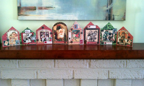
This is another one of those projects that has been rattling in my brain for a while.  Although it pained me to do so, I used up most of my Graphic 45 stash of Steampunk Debutante paper.  At least I have a pretty book to show for it!  I used a lot of items from the G45 line in this project.  The policy envelope book was one of those things I saw online and really wanted, so when I found it at Altered Art Addicts in Jackson, I was super excited. 


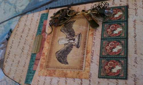
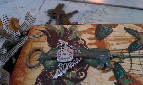
One of my favorite tricks on the cover, was how I altered the key.  I used a patina product on just the key part of the embellishment, helping the clock and wings to stand out.  I also cleverly lined up the key to mimic the pattern on the paper. 


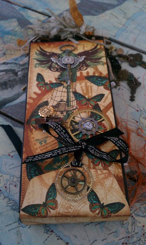
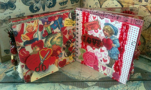
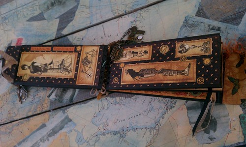
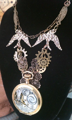
Early on in my creating process, I decided to add lots of embellishments and metal.  I love to use jewelry techniques in my mixed media projects, as this is where my creative roots lie. 


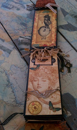
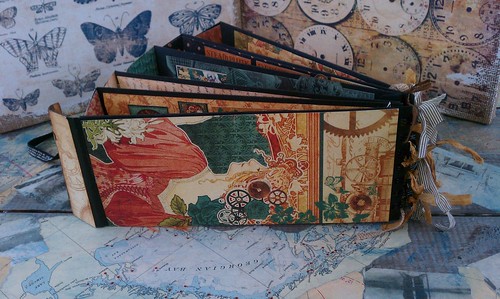
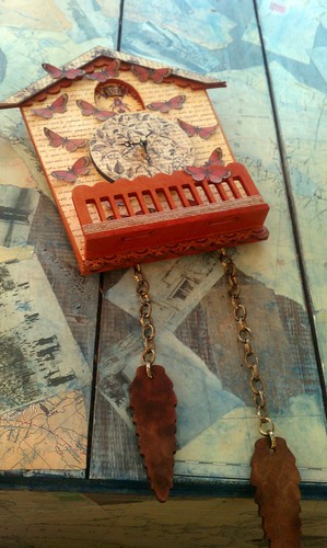
The orientation of this book also makes it unique.  I thought my use of space allowed me to use my papers in a more effective way.  I adore the wings I attached here with Tim Holtz's charm clips.  It was a happy accident but they move perfectly as you turn the pages. 


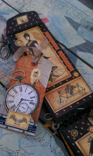
Here again I used a charm clip to attach my jewelry.  On this art charm I have a pendant I made with resin, watch parts and tissue tape.  It has been lying around for a while, I was glad to find it a proper home.


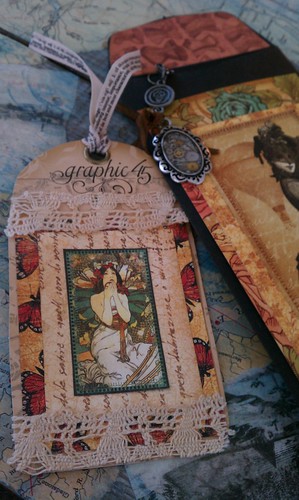
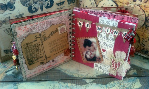
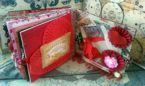
Inside of each envelope page has a little something tucked inside.  This tag was fashioned from the packaging that the Graphic 45 trims came on.  You can see the trims used through out the project too.  I love to repurpose things in my art, especially if they were meant for the trash can.  A few of these supplies also came from Dillon's Scrapbook Center, another local shop. 


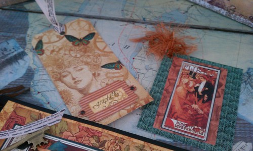
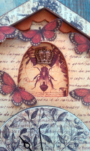
Here is another shot of my favorite gal.  I just love this sheet of paper. I made a pretty big error on this page, and I will let you in on my secret.  The framed butterfly is totally crooked.  A little bit of texture from the ribbon and a successful distraction takes the eye away from my mistake.  The wings were colored with a bit of acrylic paint and some rub and buff. 


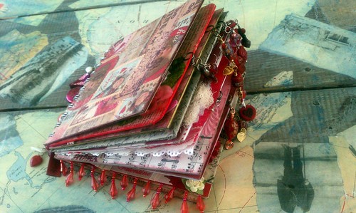
I used consistent or complementary background papers on each spread.  It helps to unite each set of pages.


I actually also mixed in some other Graphic 45 paper in this project from the Botanicabella line.  They are so smart to keep their palates similar as they blend seamlessly. 


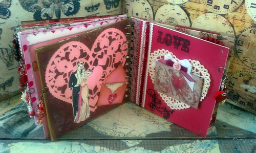
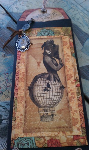
I love the little vintage "souvenir" metal embellishment.  It was given to me by a colleague who picked it up for me after seeing some of my assemblage art. 


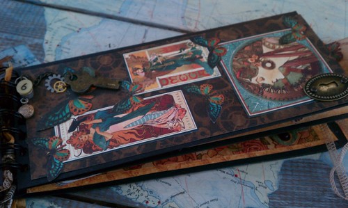
I love all the butterflies.  They were each fussy cut one by one.  I used them throughout the book, again bringing in some continuity.  Another tiny detail I added for fun, a women peeking out behind the keyhole. I wish you could see the other side of the key, there is the most amazing natural patina on there. 


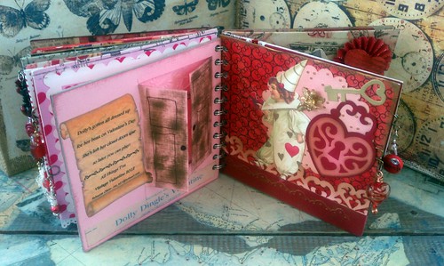
I love the little metal pull tag here.  This was done by gluing two of these little metal things back to back.  I have no idea what they were for, but they worked for this.  The background of this pull out is actually the back of a paper pack. 


One of my favorite things about Graphic 45, they include faux postage in every line.  I adore all things postal.


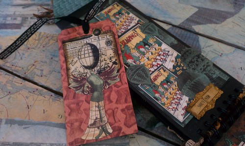
I love how all the journal jewelry can be seen on other pages. This last page has to little tags in it.  Apparently, I was on a roll!


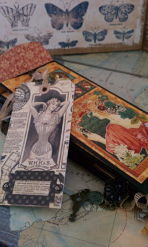
Another tag with my "gear gal" on it.  Oh how I adore her!  She looks better with real gears in her hair though. :)


I hope you enjoyed checking out my little exploration in Graphic 45.  I had a blast creating this from all those things that are so hard to use. 

My original intention for this post was to make a video tour of this book, however it proved difficult given the orientation I chose.  That was something I did not think of before assembling!  I used a lot of photos to try and assist.  My apologies to those with slow computers!

Cheers,

Rhea

Monday, February 6, 2012

Time to Fly: Vintaj

Secretly, deep down inside I dream of making my abundance as an artist, teacher and healer.  Since I have recently made some small art resolutions to move towards that dream, I am putting myself out there in the design world just a bit more.  I thought the recent offering of a "Mixed Metals" design challenge over at Vintaj would be a great opportunity to take one small and fun step in that direction. 


Update:  Thanks to your support, I finished in the lead!
Thanks to all of you, this piece will also be entered in the annual contest. 

The inspiration for this piece was the lovely pocket watch.  This vintage Elgin was found by a friend of mine while she and her family were letterboxing.  Now that I am more open about my artistry, people find and give me the most amazing things!  When I popped off the back of the watch, I fell in love with the movement.  My plans to take out the inside an make a small assemblage inside went out the window at that point. 


There is amazing workmanship inside of this little guy.  It really does make a nice steampunk focal.  I had been "saving" this for a "special" project and I am glad the inspiration struck to finally use this gem instead of just coveting it!


Another element I really like in this piece are the birds.  I added the texture seen using one of Tim Holtz's embossing folders.  Vintaj's metal accepts these prints amazingly well.  I also find their jump rings can be opened and closed several times and don't seem to lose their shape or get brittle as other base metal findings do.  Their products are pretty dreamy, I cannot wait to get my hands on the new patinas!  Some of my Vintaj findings were purchased at a new place in town called The Beading Bar

Thank you so much for stopping by as always dear readers.  Extra super duper thanks for voting, if you chose to help me out.  I really cannot express enough, how much it means to me. 

Cheers,

Rhea

Sunday, February 5, 2012

Cuckoo for Botanicabella

Inspired by so many amazing projects at the recent CHA show, I decided to try an alter a Kaisercraft cuckoo clock I have had on hand for a while.  Going with a 'use what you have' mantra, I dug into my paper stash telling myself that I really could cut into some of the papers I have that I covet and horde. Most of my Graphic 45 papers fall into this category.  I love them so much, I just don't want to cut them! I decided upon the Botanicabella collection and I think it turned out really lovely.


I love all the imagery of this line as well as the palette.  I decided to showcase the queen bee as a nod to this weeks challenge over at Simon Says Stamp and Show as they are calling for kings and queens.  I always love trying to find a clever way to intrepret their themes! The crown was altered with a bit of alcohol ink to dull it down and fit into the color scheme. 


I scattered butterflies that were fussy cut from their paper after spritzing them with Radiant Rains mist.  I left many of them with wings raised to add dimension to the piece.  


I also used distress stains on this project.  I am in total love with these.  The only challenge is getting it in all the corners.  I simply apply a bit on my craft mat and add with a paintbrush.  It is tedious, but so worth it. 


The pine cone cut outs also got a splash of glimmer to add texture and a bit of sparkle.  They were attached with some bits of chain I recently scored on clearance.  I love it when I actually find a use for those bits that I pick up "just because" they are on good deals. 

I can't wait to find a spot for my new little clock to hang!

Thank you as always for stopping by, it really means the world to me.

Cheers,

Rhea