Monday, July 25, 2011

Life at Home

I started some of the elements for this project over the weekend.  I had stopped in one of my local scrapbook stores and they just started stocking Studio 490 Art Parts.  I have been wanting to try these for quite some, so I caved and purchased the Residential kit.  They are really fun to use.


The canvas was covered with several spray inks as well as a color wash.  I sprinkled in some perfect pearls when the ink was still wet.  I love the speckled texture this provides.  This layer was then sealed with a matte spray.  I edged the canvas with tissue tape, providing a finished look to the piece. 

I played with my layout a bit by experimenting with several elements from my new stash of altered art parts.  I used the trick of adding packaging to the window again.  While you probably can't tell in the photos here, it does add a really nice finish to the small butterfly from Tim's Crowded Attic paper stash in the window. You can also see Tim's goodies on the roof top, in the charm and in the kraft paper flowers. 


Other items I used were found objects.  A tiny gear for a door handle and watch pin for a hinge and a few other oddities from the bottom of my craft stash add interest to this little piece of "Life at home."

Since this week at Simon Says Stamp and Show has a theme of "anything goes," this is it folks. 

Thanks as always for stopping by!
Rhea

Sunday, July 24, 2011

Faux Ostrich Journal

I am squeaking in at the last minute for Linda's Grungy Monday challenge, as inspired by none other than Tim Holtz.  A few weeks ago I created my first tutorial, making faux leather.  Well, while blogging I had the "aha" moment to try and use my polka dot grungeboard in this application to create a faux ostrich leather. 


I think I was kind of successful.  One thing I did to attempt to get the dots to show more was run the kraft covered grungeboard through my Big Shot after gluing.  Be careful you don't have too much glue though, mine squished out the edges, making a bit of an unexpected mess.  Also, be sure to put a piece of scrap paper between the "kraftboard" and your plates.  One of my covers has the imprints of my die cutting plates...learn from my error.  I just put this on the back. :) 

The color is not what I had intended at all.  I introduced some color wash to the mix and this really darkened it.  I found the key to get the dots to really show, was to apply my ink, dry, sand and then ink again.  I repeated this many times, misting with water at times as well too. 

While I am not totally satisfied with this project, I thought that the idea...and my mistakes my help out another crafter.

Cheers,

Rhea

Monday, July 18, 2011

Gotta Fly!

Time to raise yourself up, time to spread your wings, time to let go and fly.

This is another page created for my growing six by six chunky book, filled with challenge entries.  I am really coming to love this book, as it is filled with steampunky goodness.  The inspiration for this entry is yet another challenge from Simon Says Stamp and Show.  I also am submitting this to Gingersnap Creations as thier inspiration was watch parts, gears and cogs.  I just love how a little trigger like the word embossing along with the challenge of using watch parts starts a chain reaction leading me to something like this:


I began with a piece of chipboard recycled from the back of a stack of paper.  I chose a really pretty paper by Graphic 45 from the Renaissance collection as my backdrop.  I then added my embossed element for the challenge.  I played with Tim Holtz's new Kraft Paper and a bunch of different embossing folders.  It was quite fun. I also experimented with different inks and stains, post embossing.  Sometimes I find it helpful to just play and not be attached to the outcome. 

It is not surprising that I chose the paper embossed with the gears for the next layer of this project, I can't get enough of industrial elements in my art.  I swiped Rangers, Perfect Medium across the paper and then dusted with copper Perfect Pearls.  To add dimension, I then used walnut stain Distress Ink. This image really does not capture the shimmer of the pearls.  If you have used this product before, I am sure you know what I mean. 

A really cool trick I discovered this craft session was using Distress Stains to do your edges.  This application is quick, easy and provides great coverage.  I think darkening edges with ink makes any project element look more finished.  I used this process twice her with vintage photo, my favorite ink ever.


The next step was a simple game of matching.  I picked out a clock face and spinner from Tim Holtz and placed them in a pleasing pattern on my page along with some gears from my stash.  Now, at this point, I considered adding some wings.  I just love the whole "time flies" theme.  My muse hit and  I thought of my Caged Bird die, also from Tim, and another great way to represent flight. I cut my bird from birch bark scavenged from the UP (Upper Peninsula, for you non-Michiganders).  The intention was to use the white frayed side, but the colors and direction I wanted him to be on the page took me down another path.  I embellished the bird with a tiny metal embossed wing to look like armor.  I had to add some alcohol ink to the wing to get the color right.  The eye is a really cool piece of a watch.  

To add a verbal touch to my page, I raided a set of metal letters and luckily found my word.  Last, I wanted something to go off the page, to this end I added another odd watch part. A few more pocket watches were fussy cut from fancy designer paper.  Again, I used my new stains (I am going to need more of these for sure!) to age my watches.  I only have two colors so far, so I used antique linen and a touch of the vintage photo to make the pocket watches take on the same hue as the rest of the page.

When I went to add my newest page, it was a total coincidence that the backing paper from my Steampunk Soul page had birds on it!  I love it when it is just as it is meant to be!  Thanks as always for stopping by.

Sunday, July 17, 2011

True Love ATC

I have not made an ATC in quite some time.  This one was inspired by another challenge from one of my groups. I chose to use Tim's winged heart die again, I can't seem to get enough of it lately.


This was the first time I have used Distress Stains, what the heck have I been waiting for!  They are just amazing.  The base of the card is made from two layers of a manila folder.  I started by using permanent ink to stamp the love notes in the background.  Once the ink was dry I added antique linen stain, spritzed with water and then added vintage photo stain to the edges.  The stains provide such unique color.  The edges were then covered with ink to complete the card preparation.  I then went to work on the embellishments. 

I made the heart from dotted grungeboard.  It was colored with distress ink and stickels.  The wings were colored with Perfect Pearls, distress ink and stickels.  The crown was cut from foil, hammered for texture and then colored with alcohol ink.  For me, you can never embellish enough.  I created a long chain of charms using some of Tim's goodies and a few other odds and ends.  A lock and key brad set complete my tiny piece of art. 

I love how quick and easy ATC's are, I just may have to get back into them!

Saturday, July 16, 2011

Christmas in July

I love the yahoo groups I participate in, one of them being the OWSE.  This is more than a group, it is also a shopping resource.  Well every once in a while they have fun online events, this weekend being Christmas in July.  Now I am not much of a holiday gal, but all the previews for CHA seem to have me in the mood.  I took up guest designer Linda Ledbetter's challenge and created a little ornament.  The style of this piece was inspired by ornaments I made last season from ideas found in Cloth, Paper, Scissors.


I started with a die cut tag from Graphic's 45's Rennasiance paper.  I altered it a bit with home made perfect pearls mist. To make this sturdy I used a piece of laminate counter sample.  The existing die cut holes were strengthened with eyelets.  A few Dew Drops adorn the corners.  The crown was die cut from vintage Spriofoil, dry embossed and then antiqued with alcohol inks.  Stickels were used to add dimension to the existing flourish, the tips of the crown as well as the locket charm.  The charm started with a tiny Santa cut from Tim's seasonal stash.  Diamond Glaze and the stickels seal him safely in the locket.  The wire was doubled and coiled around a mandrel to create a textured hanger for this crafty little challenge. 

Here are a few more ornaments I made last season, many of them also having all of Linda's challenge elements.  Each of them are altered samples of laminate counter top.  Next time your in the hardware store challenge yourself to find something to craft with.  I wonder if these samples can be cut with steel rule dies....hmmmm.


The one pictured above uses a grungeboard shape, stickels, flashing tape, alcohol ink, wire, perfect pearls, and a piece of broken jewelry.


This one has a small grungboard shape, perfect pearls, a watch gear, a metal embellishment that I stamped, wire and distress ink.


I love this one.  The grungeboard heart and wings are distressed with all things Timish: inks, stickels, paint and crackle.  A little charm adds movement and the flashing foil is inked up too.


Another bit of grungeboard colored in inks and pearls.  A cute metal embellishment gives this one a bit of character.  I love how the hangers add a bit of whimsy to these ornaments as well. 

Thanks for stopping by!

Monday, July 11, 2011

Play Book

This weekend my friend Sadie came to stay with me.  Of course we crafted a little and this is what we made together. 


First we started with chipboard, this was covered in a blue floral paper by Tim Holtz.  The edges were embellished with tissue tape.  Then we made flowers with his Tattered Floral Die and added a ticket which we sprayed with Tattered Angels ink.  Last we used rub ons to add a little shimmer.  We bound this with the Cinch and added a hand painted ribbon and a faux typewriter key "S."  The inside paper is vintage ledger paper that was repurposed.   

Tuesday, July 5, 2011

Faux Leather Ledger Book (with tutorial)

I have had Tim Holtz's kraft glassine paper for some time, today I was inspired to play with it.  Here is what I made.  Faux leather!


I have seen a few examples of what can be achieved with this paper, so I knew I wanted to incorporate wrinkling the paper.  I decided to use one of the first altered techniques I learned and make faux leather.  You can do this application with a heavy paper bag instead of the glassine paper if you don't have it on hand.*

Here goes my first stab at a tutorial, please excuse my messy crafting area and simple photos.  I think I may need a tripod and better lighting!


Timspired Faux Leather

Supplies:
Kraft Glassine paper*
Grungeboard
Distress Inks
Spray bottle filled with water
Yes Paste
Semi Gloss Medium
Paint Brushes
Edge Distresser
Brayer

I started by crumpling up the glassine paper and spritzing it to soften it a bit. 


I then did a direct application of Distress Inks.  


I used rusty hinge, wild honey and vintage photo. I spritzed with water to get the inks to activate and bleed into the wrinkles of the paper.


You can play at this stage for a bit until you are satisfied.  Please note if you are using a paper bag it will get quite fragile and rip if you are not careful.  I had no issues with Tim's special paper.  Your hands will get really inky, beware!  I avoided using a heat gun with the Kraft paper, as I did not want to activate the wax coating.  If using a paper bag, let dry or use a heat gun before the next step. 


Now add a couple of rather thick coats of gel medium.  I typically wait a bit in between coats and put them on in opposite directions.  Three coats seems to work well for me. 

This is when I had my epiphany to add this to grungeboard to increase the leather like quality of the project!  What do you know, Tim made each supply in the very same dimensions...


Now, on my first page I attempted to glue the layers with gel medium, that did not work.  The grungeboard seems to be very thirsty as I think it absorbs the medium.  I stepped it up with Yes Paste and that worked great. 


 I used a brayer to smooth it out.  Be sure to get your edges really good.  
 

I then added a sheet of paper to the back and distressed the edges.

Last, I applied ink to the distressed edges.

When your done you have a fab piece of faux leather that really bends and moves.  I think the possibilities for this altered Kraftboard are amazing!


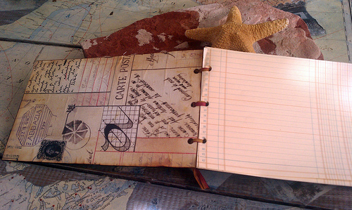
For the book, I simply made two pieces of  leather Kraftboard, lined with pretty paper and cut up some vintage ledger paper for the inside.  I punched holes with my Cinch and tied to bind with silk ribbon I hand dyed.  The bookplate is by Tim as is the Journey stamp.  I did a really neat trick of sandwiching my floating ledger paper "journey"  in between two pieces of acetate packaging. 

I hope this entry finds you well and inspires you do do something new!  I can't wait to try this with the grungeboard with dots on it, I think I can create a faux ostrich leather....

Cheers,

Rhea

Monday, July 4, 2011

4 Stars


I had this piece about halfway done when I saw the challenge over at Simon Says Stamp and Show.  This week they are looking for flourish.  I don't think I would have added these if I had not seen this post.  I love how they add an element of visual movement to my geared fireworks. I debated heavily about adding some sparkly stickels to my gears, but ended up forgoing that.  


The base of the piece is an old children's book, you can still see the cover on the back and I think I just may leave it that way.  The background, and central balloon image, come from the latest installment from Graphics 45.  I cannot wait to see what they will soon be releasing.  My mind has been reeling ever since reading Nancy Wethington's blog post about the upcoming CHA release.  What could it be???


I used some Holtz goodies as usual; seasonal paper stash, the numeral four, grunge board cut with his flourish die, a ticket, tissue tape, broken china ink and matching distress stickels.  The military badge was purchased at Micheal's on sale.  I hung it with some scrap chain and long fasteners. 

The imagery chosen has personal meaning to me.  In the areas I have lived and worked they have festivals that the images represent.  Every Fourth of July, Battle Creek, Michigan has an air/balloon show.  Also, in Marshall, Michigan there is a Cruise to the Fountain festival, where all the hot rods come our to show off every year at this time.  The word "star" was also picked due to it's connection to me and my online handle.  At the bottom it reads, "There is no place like home."  I am always missing my family extra around the major holidays! 

I almost forgot to talk about the ribbon!  I altered this ribbon under the guidance of one of my artsy pals Joanne Huffman.  She is awe inspiring with her creative endeavours.  Anyway, at our last Multi Media Mavens (M3) meeting here in Kalamazoo, she taught us this technique.  We used silk ribbon and rich dyes to get messy and make some lovely embellishments.  It was great fun.  I look forward to continuing to weave my hand dyed treasures into my work!

Sunday, July 3, 2011

Journey Around the World

A few short months ago I connected with a wonderful Yahoo group called All Things Tim.  I quickly joined into one of the first swaps I could, called Journey Around the World.  We were instructed to create fifteen six by six pages inspired by where we live, which would be swapped out with other participants around the world.  The pages were returned to us for binding and to create a cover. You can read about the pages I made here


I punched my holes with my new Cinch.  I love this crafty tool.  It was super easy to use and I had my pages and cover bound in no time with the help of some book binding rings. This book is really chunky.  Therefore I made a clasp from a hitching post, some ball chain and an eyelet.  It works very well.   


Inside I added a little flip up where I wrote in the swap participant information.  I used Tim's license plate paper and added a clever title of "pit stops."  Here are photos of the pages I received in this lovely swap.  I am so glad I participated and have such a great book to show for.


Gail Bales

Stephanie Novatski

Monica Gabehart

Ginger Labry

Rhea Freitag

Stephanie Hallit

Paula Graham

Bev Allaire

Cindy Cato

Jeannie Massie

Micheal Farrell

Yamilee Bazile

Bessie del Rosario

Kate Burroughs

Inside Back cover

I ended up with an extra page of mine.  I received two back, as I requested a specific one of mine that had a piece of vintage map from my hometown.  If one of my fellow ATT members, who did not receive a page of mine, and I don't have theirs (pictured above) wants to, I am game for a one on one swap for a page.  Send me an email and we can work it out.


Cheers,

Rhea