Showing posts with label time. Show all posts

Wednesday, February 4, 2015

Timeless Valentine


This lovely card was made with lots of great stuff from Canvas Corp.  The base of the card was misted with red, pink and bronze Glimmer Mist and I also added lots of paper and embellishments from 7 Gypsies.


The challenge was to send a card to someone you usually would not send a Valentine to.  I had just had a nice long chat with my sister, so it was she that inspired this fun card that actually made it in the mail.


I crafted a layered heart with burlap, paper as well as some 7 Gypsies tissue paper that had been covered in Ice Resin.  I love the translucent look of this element.


I stumbled across an old clock die cut that was coated in gesso, embossed and later distressed and sanded that added nice compliment to the heart focal.  Sometimes having a messy work space helps my process unfortunately.


I added some 7 Gypsies paper tape to bring in more of the vintage colors and add more texture to the background.


Finally, I used my favorite pins, also from 7 Gypsies to attach my sentiment.  In order to add more fun to the recieving of this card, I enclosed it in a quickly made handmade envelope as well.

I am excited to surprise my sister with an old fashioned snail mail hello!

Cheers,

Rhea

Sunday, August 31, 2014

Tim Holtz Clock Assemblage


I finally made the "time" to participate in one of the Compendium of Curiosities Challenges!  When I saw a short video of all the contributors samples on Facebook via Miss Linda Ledbetter, I just knew I had to join in the fun.


This baby was tricky to photograph for sure, so I took it outside for a decent shot.


I used some resin coated tissue paper and embossed scraps from Tim that I had on hand from another project.  Never throw away those scraps, you just never know when you may "need" them!


Here you can see how crusty and grungy I made the outside of the clock.  I used layers and layers of colors and product.  


Since it is so hard to see inside with the reflection, I took a picture of the base outside of the clock.  Lots of funTim Holtz goodies inside!


Don't forget to check out this week's sponsor The Funkie Junkie Boutique for lots of good product as well!

Cheers, 

Rhea


Saturday, May 3, 2014

Spring Time Book for Alpha Stamps


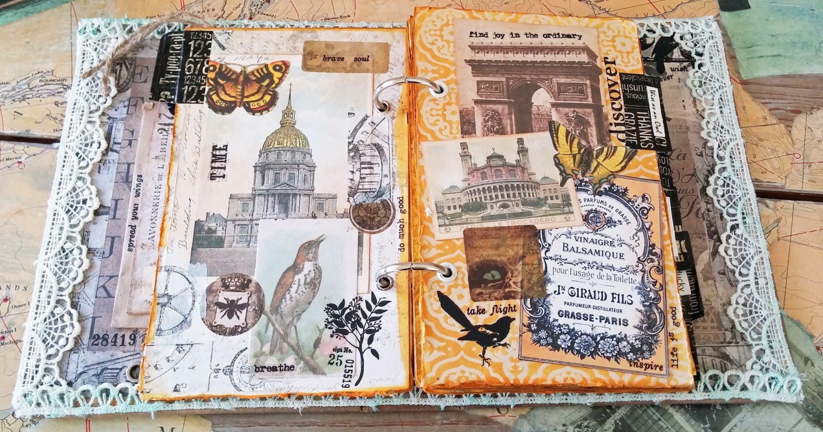
I absolutely love all the new spring time goodies I got my hands on from Alpha Stamps!


I could not wait to make this fun Spring Time in Paris Collage book.  It was so super easy with the help of my trusty goodies from Xyron.


I used a bit of Wild Honey Stain by Tim Holtz to unite the book.


To age the lovely crochet ribbon edges I actually added gilders paste to the material.  It cast a mild blue hue and I just love it.


Some of my left over Ice Resin tissue flowers ended up in my book.


The butterfly Dresden scrap made for a perfect addition.


Lots of Tim Holtz rub ons were used through out the project.  My secret is to try to use up the whole sheet so I don't have left overs.  That way I keep layering and layering them in as well.


The Tim Holtz ephemera made for great embellishments along with collage images from Alpha Stamps.


Cheers,

Rhea

Sunday, July 21, 2013

Steampunk Spells Card: Time Flies


Steampunk Spells Card: Time Flies


Steampunk Spells 12 x 12
Steampunk Spells 8x8
Steampunk Spells 6x6 Pattern and Solids
Staples: Keyholes
Staples: Key Charm
Steampunk Spells Card stock Alphabet Stickers
Steampunk Spells Card stock Banners
Steampunk Spells Card stock Tags and Pockets
Scor Tape
Distress Ink: Black Soot
Hinges
Brads
Gilders paste, copper and patina
E6000 adhesive
4 x 4 Chipboard Frame Set


I was really challenged to make this project with Steampunk Spells, as cards are not something I typically create.


 My approach here was to try and achieve dimension with collage and then finish with heavy metal elements.


On the inside of the card I really used my love for collage to decorate.


 Elements were cut from several different papers with the time theme, and then I layered away. 


Of course lots of metal embellishments were added along the way.


 I used the card stock banners in an unusual way by having them act as hinges for an additional flap on the cover.


I love the heaviness of this sturdy hinged card.  

It was really fun to step outside the box and make something that I usually don't.  I hope you are inspired to try something new as well!

Cheers, 

Rhea


Monday, February 6, 2012

Time to Fly: Vintaj

Secretly, deep down inside I dream of making my abundance as an artist, teacher and healer.  Since I have recently made some small art resolutions to move towards that dream, I am putting myself out there in the design world just a bit more.  I thought the recent offering of a "Mixed Metals" design challenge over at Vintaj would be a great opportunity to take one small and fun step in that direction. 


Update:  Thanks to your support, I finished in the lead!
Thanks to all of you, this piece will also be entered in the annual contest. 

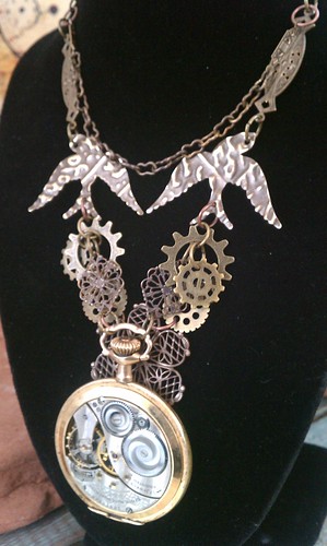
The inspiration for this piece was the lovely pocket watch.  This vintage Elgin was found by a friend of mine while she and her family were letterboxing.  Now that I am more open about my artistry, people find and give me the most amazing things!  When I popped off the back of the watch, I fell in love with the movement.  My plans to take out the inside an make a small assemblage inside went out the window at that point. 


There is amazing workmanship inside of this little guy.  It really does make a nice steampunk focal.  I had been "saving" this for a "special" project and I am glad the inspiration struck to finally use this gem instead of just coveting it!


Another element I really like in this piece are the birds.  I added the texture seen using one of Tim Holtz's embossing folders.  Vintaj's metal accepts these prints amazingly well.  I also find their jump rings can be opened and closed several times and don't seem to lose their shape or get brittle as other base metal findings do.  Their products are pretty dreamy, I cannot wait to get my hands on the new patinas!  Some of my Vintaj findings were purchased at a new place in town called The Beading Bar. 

Thank you so much for stopping by as always dear readers.  Extra super duper thanks for voting, if you chose to help me out.  I really cannot express enough, how much it means to me. 

Cheers,

Rhea

Friday, October 14, 2011

Time Flies

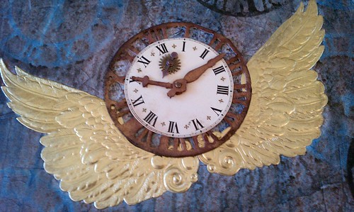
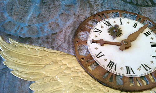
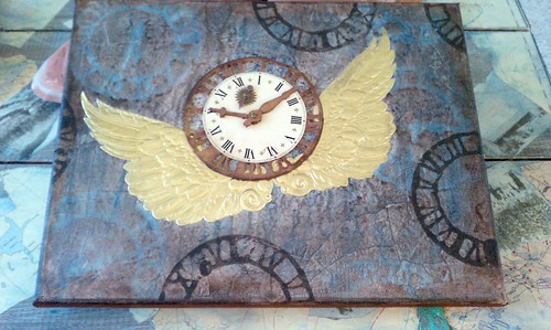
For this piece I was inspired by the weekly challenge over at Simon Says Stamp and Show.  Their theme this week:  things with wings.  This piece has been lingering in my mind ever since I splurged on those giant Dresden wings which were purchased at Alpha Stamps.  I knew one of the vintage clock faces I had from an estate sale would make a perfect match, at least in my mind. 


The face was a bit too large, but I was able to cut the thin metal with shears.  I felt it needed some sort of border and I had a light bulb moment, thinking of my weathered clock die from Tim. I created the frame with heavy chipboard, distress stain and gold rub and buff.  A few trinkets add some interest and cover a hole in the face, perfect because the spinner can still move.  I love incorporating movement and interaction in my art. 


The background was tons of fun.  There are a bunches of layers and techniques.  I used dictionary pages, gesso, distress stains, acrylic paint, stencils and stamps.  I managed to use the same die in three totally different applications in this project.


I hope you enjoyed taking in a part of my process.  Thank you so much to all my readers for stopping by, it really means a lot to me.  My blog provides me much joy, I appreciate that you choose to share the experience.

Cheers,

Rhea

Sunday, October 9, 2011

A bit of time

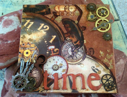
I finished up a mixed media canvas today that had been stalled for quite a while.  A swapping pal of mine sent me a bunch of goodies, and this parcel was just the stash I needed to complete this project.  One of the items I received was a Wendy Vecchi art part shaped like a pocket watch. I got this just in time to have something to enter into Simon Says Stamp and Show's challenge this week, as the theme is Wendy Vecchi style.


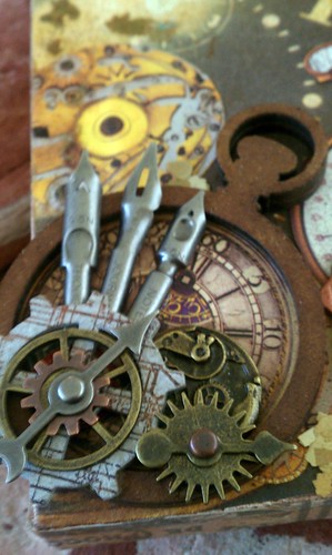
Here is a close up of the art part pocket watch.  I really had fun layering all kinds of goodies inside.  A bunch of the watch images I used were from an amazing sheet of paper I purchased at a specialty paper store in Ann Arbor called Hollanders. 


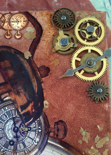
I used these great little mica flakes here and there to add texture.  I also raided my depleting stash of clock movements to add more metal elements. It was worth the sacrifice, but I am definitely going to have to find more of these.   


I am so happy to have finished up a UFO...unfinished object. :)  I challenge you readers to do the same.  Find something that you have been stalled on and see if you can find the inspiration to finish it up!

Cheers,

Rhea

Monday, July 18, 2011

Gotta Fly!

Time to raise yourself up, time to spread your wings, time to let go and fly.

This is another page created for my growing six by six chunky book, filled with challenge entries.  I am really coming to love this book, as it is filled with steampunky goodness.  The inspiration for this entry is yet another challenge from Simon Says Stamp and Show.  I also am submitting this to Gingersnap Creations as thier inspiration was watch parts, gears and cogs.  I just love how a little trigger like the word embossing along with the challenge of using watch parts starts a chain reaction leading me to something like this:


I began with a piece of chipboard recycled from the back of a stack of paper.  I chose a really pretty paper by Graphic 45 from the Renaissance collection as my backdrop.  I then added my embossed element for the challenge.  I played with Tim Holtz's new Kraft Paper and a bunch of different embossing folders.  It was quite fun. I also experimented with different inks and stains, post embossing.  Sometimes I find it helpful to just play and not be attached to the outcome. 

It is not surprising that I chose the paper embossed with the gears for the next layer of this project, I can't get enough of industrial elements in my art.  I swiped Rangers, Perfect Medium across the paper and then dusted with copper Perfect Pearls.  To add dimension, I then used walnut stain Distress Ink. This image really does not capture the shimmer of the pearls.  If you have used this product before, I am sure you know what I mean. 

A really cool trick I discovered this craft session was using Distress Stains to do your edges.  This application is quick, easy and provides great coverage.  I think darkening edges with ink makes any project element look more finished.  I used this process twice her with vintage photo, my favorite ink ever.


The next step was a simple game of matching.  I picked out a clock face and spinner from Tim Holtz and placed them in a pleasing pattern on my page along with some gears from my stash.  Now, at this point, I considered adding some wings.  I just love the whole "time flies" theme.  My muse hit and  I thought of my Caged Bird die, also from Tim, and another great way to represent flight. I cut my bird from birch bark scavenged from the UP (Upper Peninsula, for you non-Michiganders).  The intention was to use the white frayed side, but the colors and direction I wanted him to be on the page took me down another path.  I embellished the bird with a tiny metal embossed wing to look like armor.  I had to add some alcohol ink to the wing to get the color right.  The eye is a really cool piece of a watch.  

To add a verbal touch to my page, I raided a set of metal letters and luckily found my word.  Last, I wanted something to go off the page, to this end I added another odd watch part. A few more pocket watches were fussy cut from fancy designer paper.  Again, I used my new stains (I am going to need more of these for sure!) to age my watches.  I only have two colors so far, so I used antique linen and a touch of the vintage photo to make the pocket watches take on the same hue as the rest of the page.

When I went to add my newest page, it was a total coincidence that the backing paper from my Steampunk Soul page had birds on it!  I love it when it is just as it is meant to be!  Thanks as always for stopping by.

Saturday, June 11, 2011

Down the rabbit hole

Wow, it feels like it has been a while!  I guess my creative mojo took a little break, probably because my work life has been a bit challenging of late.  I made the time to check out  Linda's Grungy Monday challenge which is always inspired by none other than Lord Tim.  This week was a Distress free for all and I really enjoyed it.

I was inspired to make this project for a swap I am enrolled in, but this is another project I kind of grew attached too.  It just may live with me for a bit, we shall see as I have some time.  I just love how I was able to really flesh out this theme with supplies I had on hand.  


I started with this box I had on hand that was ready to alter.  This was sent to me in a swap and had been filled with a ton of lovely hand carved stamps.  I still have to move the hangers on the back because I had to change the orientation in order for the images I had to fit properly.  As I look at this, I realize quite a bit of the materials used were from swaps.  People send me the coolest stuff! 

The background paper was glued inside of each part of the background.  Tim Holtz's tissue tape frames out the inside of each square.  Then came the Distress inks. I used a bunch of brown tones and buffed them into the front and sides of the raw wood.  Since Distress inks react with water, I spritzed the inks to get them to intensify and blend more.  I also added a touch of rub and buff along the front for a little sheen. 


At this point, I added some metal corners from Tim.  Then it was stash scavenging time, fun.  I had just received the faux Alice stamps in a mail art swap.  They were a bit bright for the project, so enter a bit more Distress inks along with some additional colored pencil.  The mushroom was recently picked up at an antique show for a dollar.  The faux moss also just arrived in the mail from a swap as did the tiny bottle filled with "the sands of time" (shielded by the open door.)  I really like to have movement in my work.  To this end I also attached the heart shaped lock with a tiny eye bolt, yep, someone sent me that lock too.  


In the middle area I knew I wanted to use some of my small brown bottles.  I bought oodles of them at a good discount.  I bit of paper, some ink and a "drink me" label and I had some potion for my project.  A philosophy tag from Tim also goes with the theme.  I looked and looked for something that said "dream," but I could not find anything on hand.  I later did add this word from a bit of paper on an inner wall (not seen.) I knew I also wanted a playing card  in this piece too.  Due to the waxy coating it would not accept ink, I got around this by sanding and I love the texture this process achieved.  A few random wooded chess pieces that arrived in my mailbox (from a swap) fit perfect with the theme.  The metal heart was a garage sale find I believe.  I really wanted to fill the metal heart with red distress stickles. I did this, but I lost my patience as they take a while to dry, so I altered my plan and moved forward.  The flourish was sent to me and the key, I think I had.


Now, I have a tiny heavy metal printers "Q" that I wanted to use, but I was supposed to send this internationally, so I did not add it.  It probably made a good choice as the scale of the large grungboard letter works better.  It was colored with Distress Inks and coated in stickels.  I glued it down when the glitter was still wet, I am so impatient with my art at times! A cheap plastic heart shaped locket was tucked in and a royal button add some interest in this taller box.  

I knew I wanted something to do with time.  I used a Spare Part clock face and a few spinners from Tim.  The tiny teacup I just received in a swap as well.  In fact, I think this little cup and the faux postage really inspired the whole project.  When trying to add elements, I read the wiki entry of the plot synopsis to refresh my memory of both Alice in Wonderland and Through the Looking Glass.  I found that Alice in sighted "rule 42" at the royal court. I searched my vintage bingo pieces and lucked out.  

There is room for a few more trinkets in my opinion and there are a few story elements I would like to add.  Some red and white roses and a rabbit would be nice for sure.  A tiny pair of gloves or a fan would also complement the theme.  This is an image rich tale for sure, there are so many things I could see doing with this theme in the future.  So this is what the "Alice" hub-bub is all about!  Now that I have fallen in love and plan to keep it, I just may be able to continue my search and find the finishing touches.
 

Monday, May 2, 2011

A show of hands...and a few other details

Well folks, I have to say, the response to my late night post yesterday has been simply amazing!  I was blessed with 25 comments from my lovely readers when I arrived home from work tonight. Wow!!!  It just means the world to me to get feedback on my art.  I also recieved several personal messagess asking to see a few parts a bit closer.  I thought I would post again as this will provide opportunity for me to enter this piece into Simon Says weekly challenge and allow me to share a few more details that I left out in yesterday's post.  I was just so excited to share what I had been working on!


This week the theme for the challenge is hands.  My piece has vintage clock hands actually embedded right into the canvas. I topped off the hands with a cute little watch part that looks like a flower.  As I look at this area of the collage, I think it would be really cool to try and find a fine chain to wrap around those two gears. 


I did get a request to try to show off my "alternate" Grungy Monday dimention technique with a bit more detail. Sorry Tim, but I had a terrible time with the techique Linda challenged us on, so I reinterpreted the idea.  Anyway,  the picture in the previous post really did not capture what I accomplished.  Hopefully this image will allow you to see the effect this technique had on the piece.  It really is easy, if you can get your detailed cutting done well.   Again, I simply used two sheets of the same paper, cut the central image out and mounted it on top of the other sheet of paper.  Craft foam serves as the barrier to provide the dimension. 


I received another reader request to see a closer view of the other mosaic piece that inspired this whole project. I love to sprinkle Perfect Pearls and set them exactly how they fall.  You can see a bit of this technique on the background of my mosiac piece.  I  have also included a close up of another Art Nouveau gal, complete with gears in her hair.  I don't think you could see this very well in the larger pictures and she is another one of my favortie images from this collection.


Well, that takes care of the requests and the questions. Here are two more close ups of the tiny chipboard pieces I added to spots that just needed "something" but were too small for another canvas.  Yet again, a piece of craft foam helps to provide just the right amount of depth to these small additions.  The embossed chipboard was really fun to ink up too.  I just love the texture it adds. 


Thanks for stopping by!

Cheers,

Rhea

Wednesday, April 27, 2011

Altered Tissue Tape

Okay readers, I have found an awesome new technique for altering my favorite craft item: tissue tape.  This is amazing staple is made by Tim Holtz and I just can't seem to get enough of it.  Tim recently posted on his blog many ideas for this product. I simply took one of his ideas a step further and here is what I made.


It is a little difficult to see, so I included a few different angles.  The entire outside of this little shrine is covered with altered tissue tape from the Sketchbook collection.  Love this stuff!
The project started with a score from a garage sale, and old piece of dollhouse furniture.  I took off the doors and broke out the shelf that was inside.   The whole thing was colored with spray ink and the edges were coated in copper Rub and Buff.  The inside opening appeared to be too deep so I added a few layers of craft foam before I lined the inside of my mini shrine with paper from Tim's newest paper stash, Crowded Attic. 


I knew I wanted to give the outside more texture so I thought I would use tissue tape colored with alcohol ink, inspired by Tim's recent blog post.  Direct application is the trick to get the color nice and rich.  As I was applying my inks, I had a curious thought, what would Perfect Pearls do with the ink...  I dipped my brush into a pot of copper pearls and tapped it above my tape to sprinkle it on.  I then used my brush to disperse it across the tape.  My goodness, how well this worked.  The inks were still wet enough to accept the pearls perfectly and the sheen that you get is just amazing. These photos really do not capture how lovely it really looks, but you can see a bit of the shimmer in the photo above. I have since used this technique on metal too...and it works really well!

The outside of my structure was covered in the tape.  I added a crown from Tim's Ideaology collection that I altered a bit with paint and ink to age it.  My stash of found objects and goodies provided the stuff for the inside.  The bottle, also by Tim, was filled with a bit of sand and a bit of sheet music I aged with Vintage Photo and tied up with a bit of string.  I have no idea where the game piece came from, I have so much stuff in my stash!  I added one of Tim's light bulbs, a vintage clock key from my Dad and a pair of bone dice.  The charm hanging from the top is an old watch face that I attached a wing charm and spinner too. I then used some wire to create a finding.  I just love this little charm.

I am so excited to share this trick of the trade with you!  Please let me know if you try it out.  I would love to see what others can do with this little idea. 

Thanks as always for stopping by! Happy crafting!