Showing posts with label round robin. Show all posts

Sunday, October 11, 2015

Magical Woman


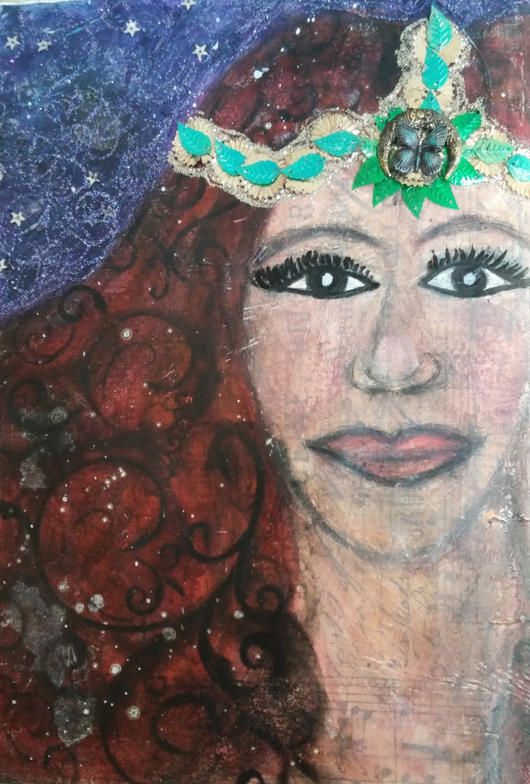
This is admittedly quite different for me!  I do not usually use people in my art, let alone try to draw them.  After a few You Tube videos on "how to draw" a few different things, I set out to create my journal page for a round robin I am in locally.  The theme of this book is Magical Women.


Since I am not present at the meetings to share my techniques, I thought I would write about a few things I did here.  It feels good to dust off the old blog!  To start out this page I added a layer of Tim Holt's tissue paper with soft gloss gel.  I then followed with a thin coat of white gesso.


Next came sketching with pencil while watching many videos.  I had to just make peace with some elements I was not happy with.  I then started to add some flesh color and hair lines with oil pastels. Pitt pens, brush markers and whatever was in my art journal tackle box added lots of elements to this mixed media spread.


To get the stencil pattern on the hair I used Pan Pastel in black, it added a great texture.  The purple/blue background started off with some acrylic paint, but also ended up with oil pastels and gelatos before I was happy with the shade.  I used a fixative before adding in my stickel swirls, and glued on sequins.  There was a bit of flicking done with a white paint pen as well somewhere in the process.


My magical women was inspired by "The Mists of Avalon," one of my favorite books with strong magical women.  Those that resided on the isle were marked by crescent moons on their foreheads.  I am hopeful the recipient likes my entry in her magical book!

Cheers,

Rhea

Monday, September 2, 2013

Shabby Chic Round Robin


Well this is the last I will be posting about my Kindred Souls round robin contributions.  Sadly this swap is coming to an end.  For this post I will be showing off two pages both with shabby chic themes.


The first book page here is for Carol.  Her theme was inspirational sayings with a shabby chic feel. She also mentioned that she liked things with wings.  I used a variety of Graphic 45 paper including sheets from A Ladies' Diary and Botanicabella.  The key and key hole were aged with acrylic paint and gilders paste.


Gloria's book continues the same theme, so I stayed in a similar color palate.  I stretched myself to use some old trims I had on hand.  Lots more Graphic 45 with chip board parts and more metal staples.


One of my tried and true strategies when edging out this type of page is to use decorative tapes.  I love that this hides my sloppy cutting.  The edges were waxed with gilders paste as well.


On the back of this page I have used a sheet from an old Sears and Roebuck catalog.  I thought the imagery fit the theme well.  I did add a subtle layer of shimmer with a spritz of ink and a stencil.


I really had a nice time stepping outside of my usual style.  This is why I like to play in swaps such as this.  I am eagerly awaiting the return of my journal.  I will be sure to post when it arrives.


P.S.  Gloria, I could not resist adding a few bits of junk to the outside of your book.  I hope you don't mind!


Cheers, 

Rhea

Sunday, August 4, 2013

Steampunk Paris


I made a little bit of time this weekend to catch up on my round robin series of art journals for my Kindred Souls group.  I have loved this project and I will be sad when it comes to an end.  The books are getting really full now and the compilations are just wonderful.


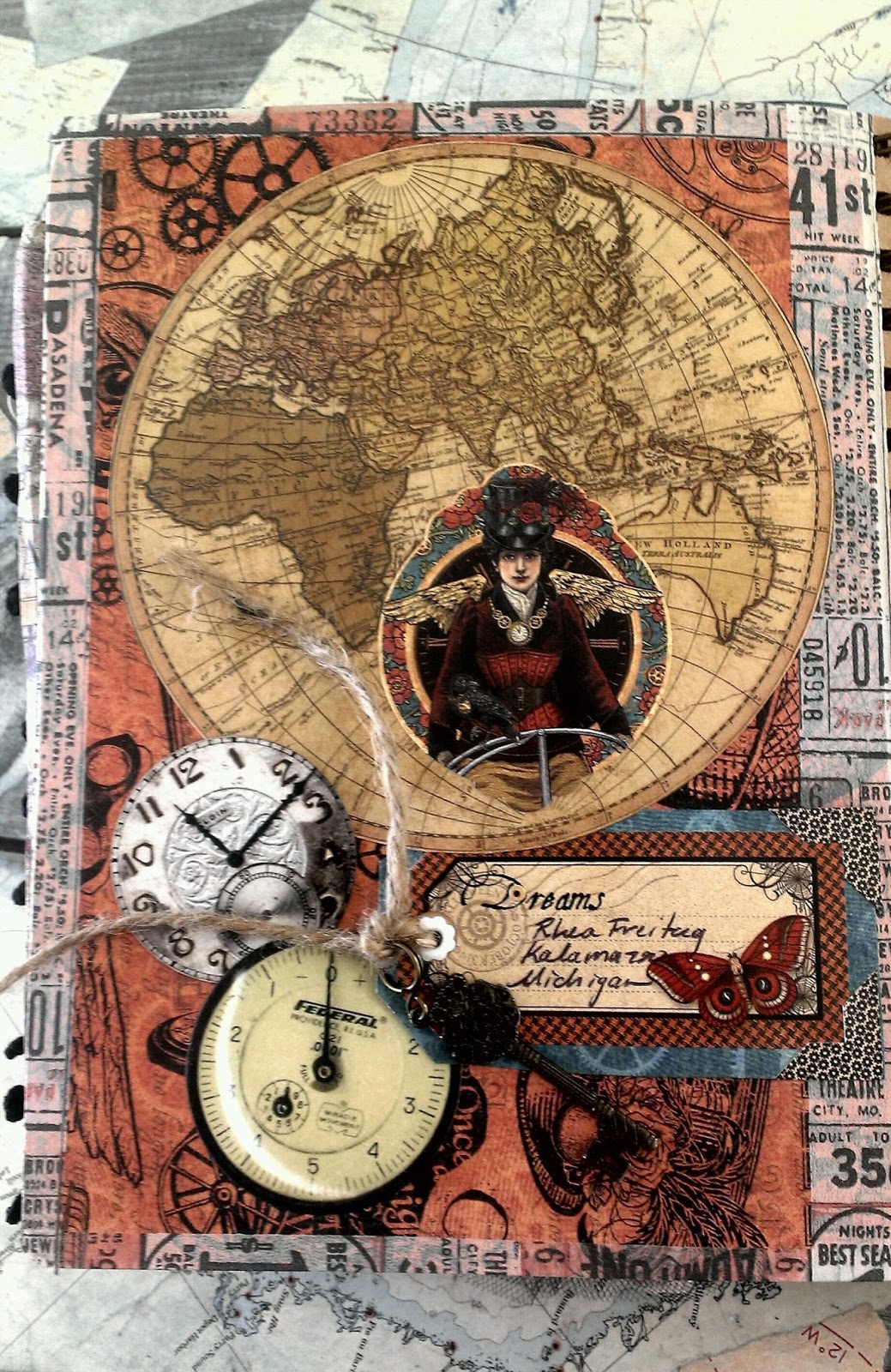
The first book is for Socrates and the theme is steampunk travel, perfect for the new papers from Graphic 45.  I started with the image from the title page, which I cut out.   Then I simply collaged with my favorite bits of junk.


On the back I kept it simple and added a map image to add to the travel theme.  I adore how this came out, and I just know the owner will love their book when it arrives home!


Next up I have Lynn Steven's book from Trash to Treasure Art.  She chose to go with a vintage color palate and a Parisian theme.  The image I chose is from Alpha Stamps and was the starting point of this page.  Lots of embellishment was added through filigree, flowers and metal elements.


Here again, another simple back.  I did not want to cover up the old tin tile image from the paper.  You should see the size of this book now that it is DONE.  Yes, it is on the way to the owner!  I hope she enjoys!

Cheers, 

Rhea


Saturday, June 22, 2013

Moroccan Doors


This is yet another installment of the most wonderful round robin through my Kindred Souls group.  The theme for Pam's book is ornate doors.  You should see the construction of her journal, she really inspired me!


I had some of the brand new Bohemian Bazaar paper and stickers by Graphic 45  on my work table, so these quickly became my starting point.


I just love the rich color and vibrant pattern.  I tried to hinge these doors several ways, unsuccessfully.  In order to be able to still peek inside, the problem was solved by showcasing them slightly open.


On the back I used a bit of watered down Peacock Feathers Distress stain to add watery interest.  

I hope Pam enjoys the contribution I made for her most amazing journal.

Cheers, 

Rhea


Wednesday, May 29, 2013

Round Robin: Feminine Vintage


Here is another installment for a round robin journal swap through Kindred Souls.  This has been such a fun event, with lots of eye candy along the way.  I really can't wait until my book returns.


The theme for Deb's book was "feminine vintage."  I hope she likes what I have created for her.  It is not my usual style, but it was fun to stretch myself with bits of old lace and flowers.


Deb plans on binding the book once it returns to her.  I can tell you from the pages in her packet that she is going to have one amazing collection of art.  It is amazing to see how different artists interpret the same theme.  I am definitely glad I participated in this exchange.

Cheers, 

Rhea


Sunday, May 5, 2013

Vintage Gentleman: Round Robin


I took some time this weekend to catch up on a round robin I have been participating in through my Kindred Souls group.  I have been super busy with work, so unfortunately I have not been able to upload all of my entries, but my big project is done so I can celebrate with a posting today!


I love the theme of this book.  I could not wait to get into my old Sears and Roebuck Catalog to find the perfect image. I think this guy fits the bill!  I started the page with a piece of paper from the Engraver line for
Prima.  Lots of inking, gilding and distressing techniques were used to yield a background with a bit of interest.  I then added my focal image and another scrap from the page I tore up.  Then I got busy stamping.  I have to say, I am so not a rubber stamper, but this was fun.  I always worry I am going to screw up the page, this time I guess I lucked out.  A few metal embellishments and I called it complete.


I kept the back pretty simple with another great piece of paper with the same line.  I did add a few more rubber stamp images since I was on a roll.  In order to grunge this piece up a bit, I tried adding some Pan Pastels for a smoky haze over the page.  

I hope that Stephen likes my contribution to his wonderful journal.

Cheers,

Rhea


Saturday, March 9, 2013

Round Robin: Faces Art Journal


This post is to highlight my recent installment in a round robin for my Kindred Souls art group.  This book belongs to Eileen, she has a wonderful blog.  The theme of her book is faces, and I have to admit, I was stuck.  I don't typically include a lot of people or faces in my work.  I really don't know why, but it has been a stumbling point in the past as well.


This sat on my art table for a while, as I slowly built up my page.  Finally today, inspiration struck and I was able to complete it.  I found the central image in a drawer of paper scraps.  A stamp that was dipped in UTEE long ago was added along with lots of layers of text and a Dresden border.  I have had a piece of resin paper I keep tearing off of, and I have been pleased to have this lying around.  


I could not help adding some junk.  I would have kept building on this charm, but I did not want to add too much weight...I think I already may have though!!!  


I had intended to add this face image, on the front of the page, but it just did not happen at the time.  I am pleased with the results on the back though, even if the subject matter is a bit mashed up and quirky. 

Hopefully Eileen will like my contribution!  I look forward to sharing the next installment as well as my finished book someday.

Cheers, 

Rhea

Tuesday, January 15, 2013

A new art journey


Recently I have made a profound connection in my artistic process.  Sometimes I need a prompt.  Whether it is a challenge, a swap, an article or a blog hop, these triggers really do help me when I am creatively stuck.  With that thought in mind, I luckily joined up in a round robin style art swap in my Kindred Souls group at the last minute.  I am so excited to be participating with a group of such talented artists.


I am a sucker for the steampunk look and with Valentines day on the way, I decided to combine the two and create a "Time for Love" journal.  My hope is that participants will add their own take on this unique mashing of classic art book themes. 


My focal here was made from 10 Second Studio sheet metal in Rock Star.  It was embossed with the gear pattern, sanded and then I edged it out in black tape.  A light buffing of copper gilder's paste added another dimension to the focal.  I added some metal bits, being sure to layer and follow the rule of odds.  Odd numbers of embellishments are more pleasing to the eye!

The wings are grungeboard and they were colored with both picket fence and the silver metallic distress stain. I finished them out with a bit more gilders paste as well as some stickels for a bit of sparkle among the grunge.  


The inside pages consist of heavy chipboard and the book was bound with a Cinch.  It really is easy to do and you get such a professional look. Each participant will have thier own page to alter in the chosen theme.  


On the back I repeated the same texture as the front.  Here you can see some of my fatal flaws too.  Because I had so much texture the stamping really did not take and I have really "hard lines" that are not very attractive.  Thus they are on the back of the book!


Here is a close up of my letters and a bit of the delightful texture.  On the letters, you guessed it, gilders paste.  In the background: lots of layers: silver distress stain, stamping, more gilders paste, molding paste, modge podge, tissue tape...


Stay tuned to see the work I do in the books of others.  I see several more creative and helpful art prompts in my future!
Cheers, 

Rhea

Thursday, April 12, 2012

Mail Art Junque Journal

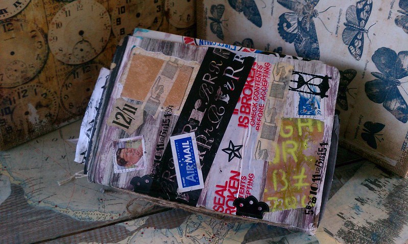
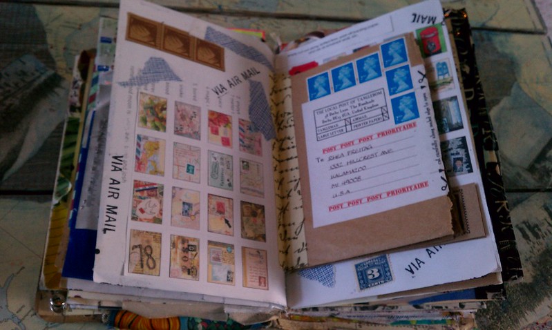
I am delighted to be able to finally show off this treasure.  At one point I thought this lovely little book was lost forever, but it resurfaced and I am so grateful.  This journal started out as a Mail Art journal,  round robin style swap through Swap-bot.  When it was returned to me there were still several pages unfinished, so I just added more of my own mail art and lots of other paper junque.  It is so fun and packed with goodies. 

I am showing off a few pictures to entice you, but I am also posting a You Tube video, as I think this will better capture all of the yummy mail art goodness inside. 


Lots of people contributed to the cover and I love this aspect of the journal.  It is hard to imagine what it looked like before I sent it out into the world.  I wish I had a "before" shot to share with you.  I picked up a few of these handmade books at an art student's garage sale.  In hindsight, I should have grabbed more than the three I did. 


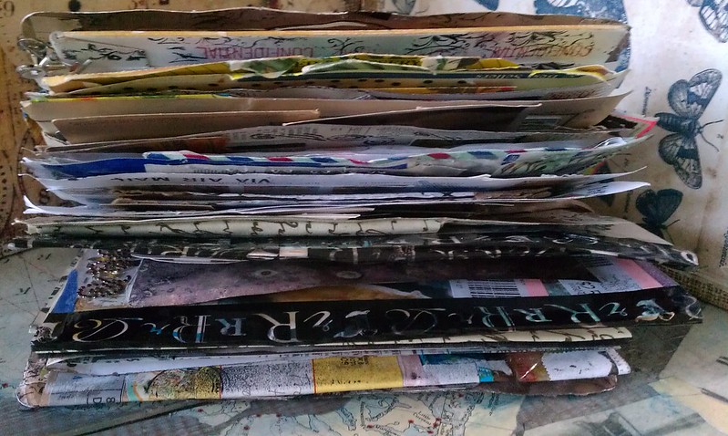
Here you can see how thick this book really is.  There are a ton of flaps and fold outs I made simply by creatively attaching envelopes with  decorative tape.  You would not believe how much decorative tape there is in this book. It makes for really good collage fodder.


These are two pieces of mail art that I had received and added to the book before sending it out.  I just adore the mermaid envelope!


Here is another great spread that is true to the original theme.  These pages were completed by Mandy, aka Farstarr.  She has a lovely etsy shop worth checking out!


Here is another one of my favorite spreads.  I made this one from wonderful mail art items I recieved from Su, aka, TangleCrafts.  She also has a wonderful etsy, filled with zines and all sorts of mail art fun.  The brown insert is actually a self mailing zine that is all mail art themed and just filled with lots of useful information and inspiration.  I thought this was a clever way to add this to my book.  I made a simple hinge with gaffer tape from 7 gypsies.

Hopefully I have teased you enough to want to take a gander at the full tour of my fun journal!  Enjoy!


Thursday, January 19, 2012

Farstarr's Mail Art Journal

Quite some time ago I started a round robin journal with a small private group on Swapbot.  It did not go as planned, but at least I finally got my book back.  For that I am grateful.  I have not sent it back out to have the other seven people work in it, because I am afraid it will not return.  I am, however, keeping up on my end of the deal and working in others books.  Since my journal is mail art themed, I have offered participants to send me a bit of mail art for me to add to my book tip in style. 

This book comes from Mandy, aka, Farstarr.  She and I have been swapping mail art in some form for a while now.  She has a love for fish and science as well as all things postal and vintage.  I think the book she altered is actually a moleskine.  It is getting really fat and full of character already.  I hope she does not mind...I added a bunch as you will see!


The cover and inside few pages were created by the owner of the journal.  I love Mandy's use of vintage ephemera and stamps.  I could not resist adding this German scrap fish to the front.  I am hopeful she does not mind that I added this here. 


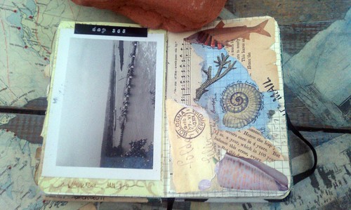
I got a little carried away on the inside cover too.  I had some stickers that I thought would go really well with her journal, so they found their way on the page too.  Each page I worked on has an imprint of a vintage Via Air Mail stamp.  I thought this was a clever way to "sign" the page, without being obnoxious. 


This is the first spread I did.  It was quick and easy to do since Mandy sent along an envie of dreamy ephemera with her book.  I did find though that the pages I did with her stuff look very similar to the other entries, so I later ventured into my own stash to switch it up.


I just had to use the vintage picture that was in the ephemera envelope.  I love the look of an old photo.  A simple label was added to the top of the page, I titled it "day 365."  Hopefully the owner appreciates this nod to her Mail Art 365 project. 


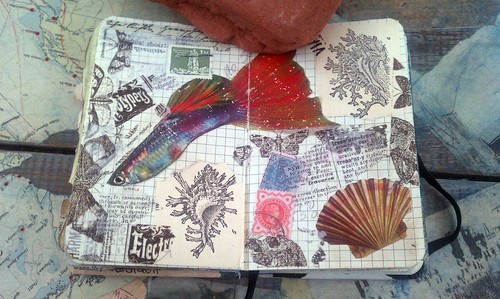
This page is filled with simple collage and scraps from my work table.  The guppy was in Mandy's stash, and I added a cute title after taking the picture.  It will just have to be a surprise for the owner.


This page also had a few additions post photos due to composition issues.  It was too dark to retake them when I realized this.  Bring on the longer days for better blogging!  Anyhow, I also decided to cover up the surfer, as the owner of this book really does not like people in her art.  Don't worry Mandy, the surfer is gone!
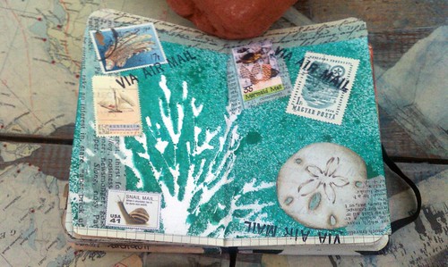


This background was left over from one of my first swaps on the bot.  I thought it was a nice addition to the book, something different.  I also added a few scraps, some used stamps as well as some artistamps I had in my stash. 


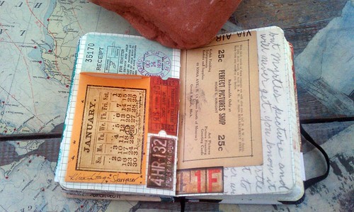
And here is my final spread.  This layout is much different than my usual style.  I embraced the straight lines for once.  Here I used an old letter, some vintage ephemera from my own stash as well as a few of Tim's salvage stickers to finish the page.  I love the small envelope glued on the page.  I enjoy having interaction in my work if I can add it.

Since this week's challenge over at Simon Says Stamp and Show is to show off "anything besides a card," I am going to link it up.

I hope you enjoyed seeing inside of this wonderful compilation of mail art!

Cheers, 

Rhea 

Friday, September 23, 2011

I love snail mail

So I recently blogged about getting my completed mail art zine here.  I just received another issue to work in and I was super inspired.  I managed to get it yesterday, and it is is the mail today.  I just love how projects like these help push me into creating. 

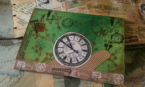
The theme for this little book is snail mail.  It would seem that we were all inspired with a literal translation of the theme as there are super cute snails in every entry.  As you will see, I followed suit.


I had cut out a different "shell" all together, my messy craft table helped a new shell to be made, and I am much happier with the outcome.  As many of you know, I love clocks and time imagery.  How fun to incorporate a snail's pace into my contribution.  The transparency clock shows some vintage ephemera below from an old adding machine workbook.  I also used a bunch of rub ons.  Super fun, easy and spontaenous work. 


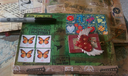
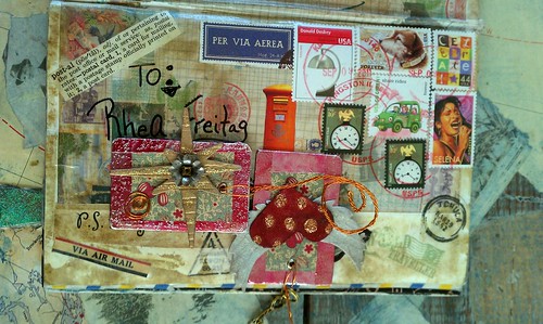
Here is the front.  Please excuse the found objects keeping all the addresses confidential!  I love the stamps I used on here and how they go with the nature meets mail theme. 

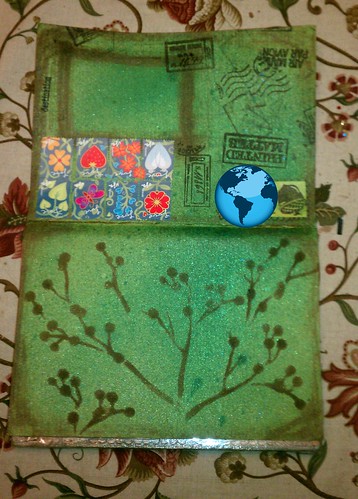
When making this page I tried a new technique that I just adore.  The base color background is color wash and glimmer mists.  I wanted to add some texture, so I busted out a new stencil.  I was so inspired by stencils used at my recent creative retreat.  The one shown here was by Martha Stewart (she has bunches of new stencils at the big box stores).  Now the fun part...I used vintage photo distress stain with the stencil.  Heaven!  So easy to apply and super easy clean up.  Here is a photo before I added all the other layers...


I hope this post inspires you to get out those stencils.  They are so much fun!

Cheers,

Rhea

Tuesday, September 13, 2011

My Mail Art Zine: Complete!

Last year I started in a few different mail art projects.  I was quite excited today to see one of them had a positive outcome, as the finished product arrived in my mailbox today.  It was hosted on Swapbot by Mandy, aka, Farrstar.  You can see how to make a zine such as this on Mandy's blog

We made our book from heavy card stock and simple stitching.  The first pages, below, were completed by me.  I set the tone for the book by writing what I love to hopefully inspire my swap buddies around the world.  I am so pleased to see that they did not even cancel my stamps at the post office.  I had a few special ones I used on this piece as I knew they would come back to me!

To mail, you fold the book closed, tape it well, address it on the outside, then the zine becomes traveling art for all to see.  When the next person gets it, they add their art and fold in half and have a new postcard side and image side.  As you will see, many of us used every inch for traveling art!

I have used some hand made Christmas Ornaments to conceal addresses in these photos. 


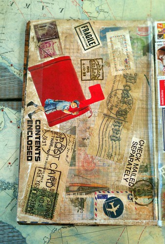
The next two pictures are now my cover and my back.  This is how the zine naturally lays due to it's most recent postal adventure.


I just love the big red mailbox as well as the carrier.  These pages have all kinds of postal goodness upon them!  I am happy that these have become the outside of my zine. 


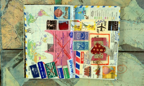
More maps, stamps and air mail stickers, yum.  There are some awesome stamps from down under.  This book traveled far and wide:


The tape used here ended up becoming a part of the art.  Love it!


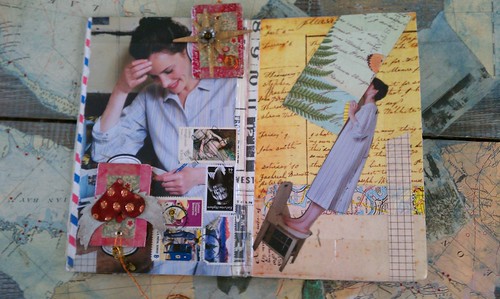
There are a ton of cool stamps on this page.  I love the background script paper.  The pages below are done by our hostess, Mandy.   


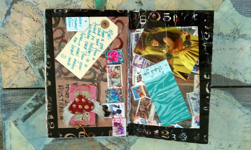
Very interesting imagery used here.  I love the tapes used.  I am obsessed with decorative tape! 


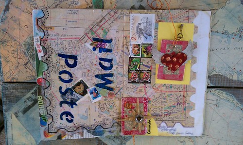
The big scalloped edges made to look like a stamp are a really nice element to this set.  I love the stenciled letters too. 


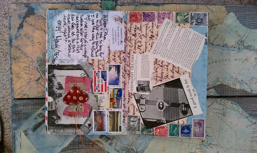
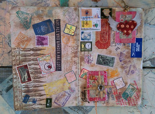
 Another favorite, above.  The stamped image of the pen nibs is to die for.  The palate is something I would totally do and there are quite a few artistamps on here. 


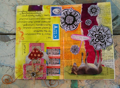
This set has nice colors that are out of my usual range.  The bizarre imagery makes me smile.   


And this concludes this project, at least in my book.  I still have two or three more zines to work in before this adventure is totally complete.  What a great group of people.  This took some serious time and commitment and the results are totally worth it!

Cheers,

Rhea