Monday, April 30, 2012

Putting steampunk on the map

So one of my smaller art groups, Altered Without Limits, is hosting a really fun swap right now.  I took some time this past weekend to create the pages and I always love to celebrate with a blog post.  The central image needed to be created with a map as the focal.  The artist is allowed to do what the will to alter the map as long as it also fits into the steampunk theme. Our pages are six inches tall by four inches wide and there are ten of us in the swap.


I chose to use my favorite Tim Holtz die, heart wings.  I knew I had a boatload of maps to use for this project and of course I could not find them when the time came.  And yes, I unearthed the lost maps exactly when I had completed my pages! I ended up scavenging a few outdated ones at work which I used creatively for my heart and wings.  The actual wing area was cut from the index section, while the hearts came from more populated areas.


Of course you can hardly tell what is going on these pages now as there is so much going on. I layered and layered many techniques to each little element along the way.   I do feel in hindsight that the mica was too much, it just seemed like a good idea at the time.  Oh well!


If you look really close above, you may notice the geared up background.  This is foil "waste paper" from an industrial re purposing store,  that I have embossed.  Layers of tissue, matte medium, inky mists, watercolor crayons and graphite add depth and interest and grunge.


I dipped into my stash of resistors and added them to the mix.  I thought it was a nice industrial element to add to my heart.  Another element here are these great Masonite gears I picked up from Retro Cafe Art, a very fun artsy resource.  I embellished them with a bit of paint before using up the rest of my spinners from Tim Holtz.  


On the back I kept it simple and embellished a coin envelope and stashed a tag inside with my information on it.  I always love the element of interaction in my paper arts.  I am completely hooked on the distress stains, I hardly ever bust out my ink pads anymore with these around.  It also just so happens that this week's Compendium of Curiosities challenge is to marble stains, which was done to the actual heart pieces and the technique is outlined in Tim's newest book. Distress stains were actually used throughout the project heavily. Please stop over and see what Linda is up to on her blog, she has partnered this week with Eclectic Paperie for this week's challenge.


I really can't wait to see what the rest of the group creates.  I will be sure to share my amazing book once the swap is complete.

Cheers, 

Rhea

Friday, April 27, 2012

A new creative challenge

I was recently contacted by a gal named Teri who asked me to participate in a special crafty event.  Teri and I crossed paths once through a local art meeting and I am so grateful for this chance meeting. 

The challenge is to decorate a paper mache dress form using 80% reused, recycled, re purposed or reclaimed materials.  We cannot spend more than $20 on additional supplies.  If my piece is selected, it will travel to at least 12 trade shows through out the United States through the Original Sewing and Quilt Expo.  The project is called Runway "Re-View."


When I was first approached about the project I really resisted as fabric is just not my thing.  I hope to really use a lot of different materials in interesting ways to dress my form.  I do have to say the scale is much larger than I had anticipated, so that will also be a challenge for me.  I wonder what all those quilters and seamstresses will think of my crazy mixed media antics!

Stay tuned to see how my little project unfolds.

Cheers,

Rhea

Sunday, April 22, 2012

New creative space

So this weekend I expressed my creativity in a bit of a different way, I made a really useful home office.  My house is quite large for just me and I have a few rooms that could use some love, purchasing a nice desktop computer and printer inspired me.  I had a bistro height table left over from my last place that was re-purposed it as a desk, the extra height is lovely.


Sorry about the overexposure in the photo above.  The room gets so much light so I was really not able to get a good shot, but I hope you get the idea.  The computer and a new color printer are going to be a huge asset to my creative work.  I think this may end up be the place I bead as well.  My studio space in the basement has never been conductive to this kind of work.


Along the wall I have a bank of shelves that were installed by some amazing friends.  Here resides a good portion of my books along with a bunch of personal mementos.  As I was sorting through things and reorganizing I came across some personal treasures.  My great grandfather Henry Salo had a brilliant creative mind.  I like to think that some of my artistry is channeled through him.  I came across a puppet he made from a sock, buttons, yarn, a rubber band and a hanger.


I also found these place mats that he wove, they make me smile.  I have a few other treasures made by the hands of my ancestors. I hold these items and memories close to my heart and try and tap into that energetic support as I continue to try expand my artistic offerings.  


While I may not have a cool book to show off, or a neat piece of assemblage, I still feel artistically complete as I write my first blog post on my new computer.  I have a feeling I am going to write a lot of good things in my new creative space.  

Cheers, 

Rhea

Monday, April 16, 2012

Think Pink with Alpha Stamps

Alpha Stamps is excited to hold their first ever art challenge on Facebook! Please stop over for some inspiration, sharing and a chance to win beautiful art by Teri Calia. Entries due by May 15th.  For those of you who choose not to participate, you can always vote for your favorite entry.   


Thursday, April 12, 2012

Mail Art Junque Journal

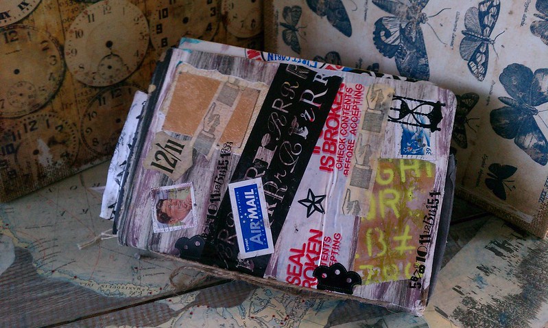
I am delighted to be able to finally show off this treasure.  At one point I thought this lovely little book was lost forever, but it resurfaced and I am so grateful.  This journal started out as a Mail Art journal,  round robin style swap through Swap-bot.  When it was returned to me there were still several pages unfinished, so I just added more of my own mail art and lots of other paper junque.  It is so fun and packed with goodies. 

I am showing off a few pictures to entice you, but I am also posting a You Tube video, as I think this will better capture all of the yummy mail art goodness inside. 


Lots of people contributed to the cover and I love this aspect of the journal.  It is hard to imagine what it looked like before I sent it out into the world.  I wish I had a "before" shot to share with you.  I picked up a few of these handmade books at an art student's garage sale.  In hindsight, I should have grabbed more than the three I did. 


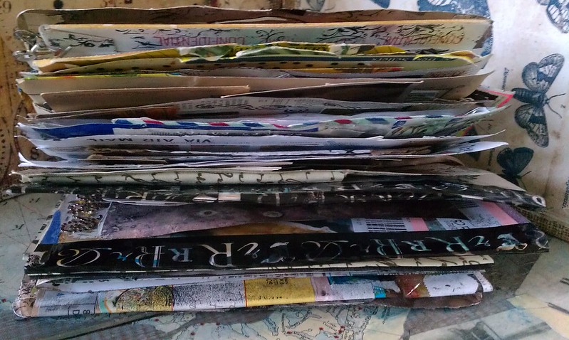
Here you can see how thick this book really is.  There are a ton of flaps and fold outs I made simply by creatively attaching envelopes with  decorative tape.  You would not believe how much decorative tape there is in this book. It makes for really good collage fodder.


These are two pieces of mail art that I had received and added to the book before sending it out.  I just adore the mermaid envelope!


Here is another great spread that is true to the original theme.  These pages were completed by Mandy, aka Farstarr.  She has a lovely etsy shop worth checking out!


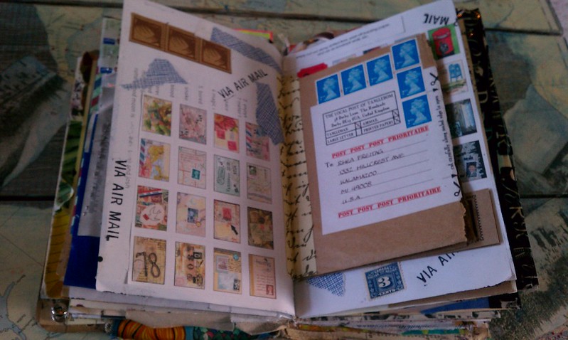
Here is another one of my favorite spreads.  I made this one from wonderful mail art items I recieved from Su, aka, TangleCrafts.  She also has a wonderful etsy, filled with zines and all sorts of mail art fun.  The brown insert is actually a self mailing zine that is all mail art themed and just filled with lots of useful information and inspiration.  I thought this was a clever way to add this to my book.  I made a simple hinge with gaffer tape from 7 gypsies.

Hopefully I have teased you enough to want to take a gander at the full tour of my fun journal!  Enjoy!


Saturday, April 7, 2012

My Olde Curiosity Shoppe

I am so happy with my latest project.  The new line Graphic 45 recently released, Olde Curiosity Shoppe, is simply amazing.  I have had my stack for a while and yes, I had to talk myself into cutting it. 


The tray was picked up at my not so local crafty outlet store. I love, love, love this place and usually make the hour trip about once per month.  I would be in trouble if it were closer.    I paid about five bucks for the tray because there were a few scratches on it. 


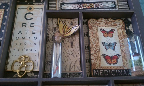
I am not sure where I found it, but the button is a treasure.  It is from the Detroit Police, close to where I grew up.  In order to add texture moss was added. It makes for a nice curious bit for my tiny shoppe.  In order to achieve more dimension I layered paper and also used tall glue dots to raise some of the imagery from the back of the tray.   Some of the butterflies are also popped off the page for interest. 


Here is a bit more moss too.  I kind of went with a flora and fauna idea when searching for my curiosities.  I had some shells out on my work table and thought they were a fun addition to my assemblage. Lots of distress stain was also used to make my edges finished and old looking.  I cannot live without this stuff.   


I could not resist adding a tiny gadget, otherwise known as a watch movement.  Who would have thought I could include nature and industry in one piece and have it actually look cohesive?  Thanks to Graphic 45 for that one!


Lots more metal goodness here.  I aged some of my new stuff to make it look old.  I rusted the pen nib as well as the clock charm.  The tiny clock key was altered a bit with some black acrylic paint.  I was not even searching for that little doodad, but knew when I stumbled upon it that it had to go in this piece.  The old watch spring was crammed into a tiny bottle alone with another coil of wire. 


More fun stuff in these little areas too.  The paper had a nice image of the women's legs in a bottle.  I cut off the bottle off the image and used their idea by adding it to my own little bottle.  This was the perfect project to add another one of my little apothecary domes with a mushroom inside.  So super fun and cute.  I thought  the Girl Scout pin was another unique addition. 


I have been hanging on to this large clock key for a long time.  It was a score from my dad.  He has the best stuff and once in a while I get to partake.  This project is the perfect place to display it.  The flakes inside of the jar are burnished mica flakes and they are available at Alpha Stamps.  They also have all this wonderful paper over there and apothecary domes too.  Yes, they are my favorite shop due to my wonderful new Design Team appointment. Their shop is worth exploring!


 Another clever trick.  I mounted some left over eggs I had right to my shrine.  I love how this mimics some of the imagery in this paper line.  Most of the trinkets in this project are simply held with matte medium.  It pretty much just disappears.


To finish the tray I added the last of Tim Holtz's box corners.  I am sad my supply is diminished, these are good staples to have in your stash.

I hope you enjoyed browsing my own little Shoppe of Curiosities.  It sure was fun to assemble.  Since assemblage is one of Wendy Vecchi's styles, I am also entering this into Simon Says Stamp and Show's weekly challenge.

Cheers,

Rhea