Wednesday, October 31, 2012

Sweet Sugar Skulls and Texture Tutorial


Recently I made some delightful replicas of sugar skulls.  The base of  these pieces has a really nice crackle texture, which was achieved with a fantastic product called Kroma Crackle. It is a product that is hard to find, but Alpha Stamps was able to source it.

In this post, I will break out each step to achieve the texture, once I have covered that, the decorating is on you.  Yes, I know it is hard to see the crackle effect, but with so much good stuff from Alpha Stamps, I could not help decking these gals out!  You will see some testure close ups later in the post.  There are lots of great supplies from this tutorial for your very own projects here.


And here are a few more cuties!


To start off, I gave my pieces a good thick coat of gesso.  This helped to give each piece a bit of tooth and made for a good white base to work off off.  Tip:  Use a good artist quality gesso.  There are some really affordable ones out there, but I would pass them by, because you just don't get good coverage with the cheap stuff.


Once you have your gesso down and it has dried, it is time to paint.  Choose the color you want to show through the crackle.  Again, here, white was the best choice for me.  Now the manufacture label advises to use high quality acrylic paint.  I followed suite and used Golden Titanium White, but I have to say I have used this stuff with cheap acrylics and it worked just fine.  


Of course I did not realize I missed painting a few spots on the teeth until I wrote this...  That is a good artistic tip by the way, if your wondering how composition is going on a project, take a picture and look at it.  You will be able to see right away if there are areas that need to be edited or spots that need a bit more embellishment. I can't tell you how many times I need to re-shoot images for my blog because the photos revealed scale issues, glue blobs and all kinds of errors. 


Now it is time to get crackling.  Add a layer of Kroma Crackle to your dry pieces.  The thicker you apply, the larger your cracks will be. You will notice in the picture above that the smaller skulls appear to have color changes.  I think that the product reacted with Masonite in some way.  I did not mind because I was going to be getting them all grungy anyway. 

Please note, this product does take a long time to dry.  There is an "instant" way to crackle that has been made famous my Michael deMeng as outlined here.  I have yet to try it out for a silly reason, I always forget to buy Elmer's school glue...


Here is a close up of the crackle texture on a different project I am working on.  This is a book and the only base I have on this is gesso, I totally forgot to put the acrylic paint on it...but it still worked!  You will notice in some areas, where it was perhaps too thick, the crackle is curling.  It is possible that some of the texture could come off, therefore no matter what, you need to use some sort of sealant at this point.  Use dry brushing with layers of paint to add color.  Or on the book below, I used spray inks.  Again, you would not want to use too much of anything thick as you would lose that yummy crackle.  

The next step is to seal with something pretty fluid as you don't want to lose all of your hard work.  The manufacturer advises to use acrylic fluid medium.  I watered down regular gel medium and it worked just fine.  I also got creative with sealing on the book pictured above as you will see below.   


It occurred to me that there had to be another way to seal the crackle.  I have been on such an UTEE (Ultra Thick Embossing Enamel) kick, that I thought this may be the answer and indeed it was!  I added lots of layers of clear embossing powder with a bit of gold embossing powder sprinkled in as well.  Now I wonder what this little book is going to turn into...stay tuned in to find out.


I hope you enjoyed this little tutorial on texture.  My intent is to always inspire and share my love of good fun products with you.  I hope I achieved that goal today!

Cheers, 

Rhea


Friday, October 26, 2012

Altoid Tin Apothecary


This was another fun project completed for Alpha Stamps.  I started off with a blank Altoid tin.  I had a blast making it into a tiny apothecary, as inspired by Laura Carson and her Pretty Potions and Poisons Apothecary Event.  Laura also blessed me with a little surprise, so read on to see what she made just for me!    I am so lucky and blessed in the crafty world and I am so super grateful for all my artsy blessings.


The cover was really simple.  I used one of these really cool Halloween Die Cut Stickers as the main focal of the top.  I thought it went well with what is inside.  The edges were trimmed with decorative tape, flowers and a bit of trim for texture.


Inside I added all kinds of teeny tiny potions and bottles.  I really liked working with the Masonite Bottles which were flat and helped my project have lots of depth.  I lined the background with three of them before adding lots of other small bottles to the mix.


To achieve lots of texture I glued in two types of moss.  I think that these always add a spooky element.  It is amazing that you can cram so much art into a tiny tin!

Now for my fun news compliments of Miss Laura Carson, she made me a custom blog button! I just love how she created something just for me, it really suits my style.   You can even grab the button and show if off on your own blog, should you be inclined to do so!  The code is over there, on the right.... 


As always, I hope you enjoyed your stop to my little crafty corner of the universe!

Cheers, 

Rhea


Saturday, October 20, 2012

More Bird Song Bliss


Recently I made a really cool project using the new Birdsong Bliss paper from Graphic 45.  I was a bit surprised at how much I fell in love with this paper.  It is not a theme I have gravitated to in the past.  I think it is the rich color palate that really drew me in.  Anyway, I had so much fun with my first project that another one quickly followed.


The red Dresden borders worked out wonderful and really helped the outside of the project some cohesiveness.  It may be hard to pick up, but I also used a sheet of mica over the central image to add a layer of interest and dimension.  I know get what all the fuss is about in regards to mica! 


All the fun metal bits, beads and charms really make for some interesting embellishments.  The lions I adore, so I had to make sure I got a shot of them in my post.  They are on both sides of the box.  I have to say the embellishments are my favorite part of a project.  Since this is the theme over at SSSS, I am going to show this off over there too.   


Since this Graphic 45 box was on a smaller scale I was able to use the same background paper on each panel resulting in a tighter palate.  


Another way I kept things cohesive was by using similar embellishments throughout the project.  I cut out the lanterns from this wonderful sheet of paper and added them throughout the accordion book.  


These little resin birds are fab.  As you can guess, I distressed them up with a bit of guilders paste.  The flower embellishments were a bit too bright, so a little distress ink was added to grunge it up a bit.  


Here is another detail shot of one of the panels.  I had to make sure I used that dragon lantern!


I hope you were inspired or learned a little trick or two.  Thank you for taking the time to stop by and comment if you choose.  All that feedback I get from you all is what keeps me going!

Cheers, 

Rhea

Tuesday, October 16, 2012

Altered Potion Bottles


So the latest installment of swaps from Alpha Stamps proves to be intriguing as always for Halloween.  Inspired by Laura Carson's Pretty Potions and Poisons Apothecary event, this swap is a fun way to exchange bottles, yet have a more customer friendly mailing format. Please click the button on the right for more information on the swap.


My favorite part of making these was playing with Tim's new metallic stains.  They are seriously dreamy right on chip board.  Add a few splashes of water after a direct application to get the distressed look, then buff in some black ink and cardboard turns into metal.  And you all know how much I love metal...  These stains have become my new favorite, which is the theme of the challenge over at SSSS, so I am throwing this post in the mix!


I had fun using the black dazzle lines.  They are so simple, yet when combined creatively they really added great texture and borders on my bottles. 


Here you can really see a lot of the bare chipboard with the stain and ink.  Pretty nice metallic effects.


I used some of Graphic 45's Happy Haunting paper along with classic skulls from Alpha stamps to treat the backs of the bottles. 


I tried to make clever bottle toppers along the way.  I used filigree and trinkets to layer my tops. Layering is a great designers' trick by the way, it makes projects look more interesting and adds additional texture.


I added some funny little cat eyes to this guy and it changes up his look. 


Here I used lots of layering.  There are actually two die cut labels on this separated by a metal filigree piece.


I love the technique I used on the silver spider.  This was simply using a stencil and some stickels.  I can't believe the level of detail.


I hope you are inspired or perhaps learned something new!  I just adore the chance to share with you all. 

Thanks as always for stopping by and checking things out.

Cheers, 

Rhea


Sunday, October 7, 2012

Spooky Halloween Matchbox


This was such a fun little piece to make.  I never can get enough of assemblage work.  The box was sent to me from Leslie over at Alpha Stamps.  It did not take me long to dream up some fun applications for this little Graphic 45 treat.


I am on a total melt art kick right now.  I used UTEE on my owl charms in the previous post, and the metal numerals in this piece got a similar treatment.  I started by painting them with black gesso.  I then placed the numbers inside of my hot melt pot and sprinkled them with a bit of bronze embossing powder.  They were finished off with some clear embossing powder.  Pretty cool effects.


Now these flowers did not start off in this spooky gray color.  I did not have anything that matched my palate, so I used my stash to transform them to something that worked.  A creepy spider bead adds a nice little Halloween touch.  I am surprised he made the cut....I really, truly on a very deep level, do not like spiders.


The inside of the box holds a lot of creepy fun.  I started with a ghost image that was printed on vellum.   The back of the vellum was painted with gesso to make the ghost pop a bit more.  I then burned the edges to mimic the shape of the ghost.  The memo pin holds him up, but to add a bit more mystery and shimmer I made a mica sandwich and tore some of it away so the ghost peeks out.  I added the moon subtly in the background to add some contrast.


The inside of the matchbox was treated with black gesso and then glittered with these amazing blue mica flakes I had in my stash.  To add movement, a bat charm charm dangles from a bit of black cording.  The bottom is reindeer moss and a few little bits of junk.  The raven is one of my favorites in here.  The tiny piece of rib cage was actually a broken bit.  This goes to show it is worth keeping those things sometimes!


The trick I used to cover this box in very short order was to simply use washi tape.  I am addicted to tapes. The little window on the front and the fence was treated with both black and white guilders paste to give it a spooky look.  

Thanks as always to stop by and take a peek at my work!  I do appreciate each and every one of my readers.

Cheers, 

Rhea 

Saturday, October 6, 2012

More Halloween Charm


I am participating in yet another Halloween Charm swap.  This one is being hosted by Thespa over at Vintiquities Workshop.  As always I am excited to see the return on these mini art exchanges.  I had a few stumbling blocks with this swap, so participants will be getting two charms from me.


This is the first set that I am not all that pleased with.  When I went back to review that I had followed all the rules, I realized paper was a no-no, so I had to go back and seal them all with Glossy Accents.  They now probably meet the requirements, but for whatever reason I am not all that into them.


I decided to make a second set since I did not like the first round and send both along.  This set does not meet the requirements either as each charm was supposed to be different, or small sets of five were allowed.  I hope that my stuff flies with the hostess!

Stay tuned later this month I hope to show off what I did with my charms in a little blog hop. 

Cheers, 

Rhea

Tuesday, October 2, 2012

Radiant Raven: Vintaj


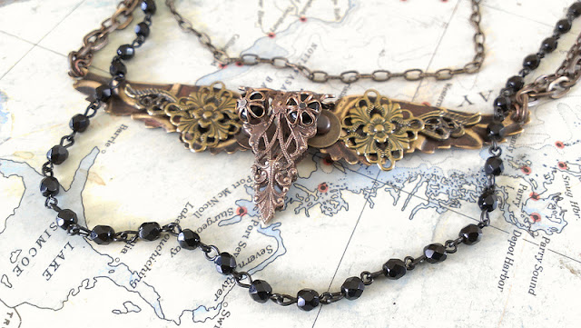
I came across another Vintaj challenge that piqued my interest, so I decided to make a little something for the "Radiant Raven" contest.  My intent was to take simple filigree pieces from the Vintaj line and use them to make something that resembled a raven.

Please consider voting for my piece HERE. Mine is #9, there are some really amazing pieces that will be tough to beat!


The wings were embossed with a spiral pattern and I used guilders paste to grunge them up a bit.  


The head of the raven is a piece of filigree that I simply folded in half.  Eyes were added with headpins, bead and Vintaj bead caps.  I love how it gives it a bit of a clockwork look. 


Some of the elements used in this piece were from Alpha Stamps.  They have a delightful selection on all kinds of jewelry stuff.

Thanks for stopping by and taking the time to vote for me!
Cheers, 

Rhea