Showing posts with label Typography. Show all posts

Sunday, January 25, 2015

Graphic 45 Steampunk Valentine


And the season of love is upon us!  I am not all that much of a card maker, but I am always up for the challenge of designing for Graphic 45.  


I have even made a snapguide outlining how I made this card if you are looking for a little more in depth inspiration.


One of my favorite elements was using my Dymo labeler.  I had forgotten I even had the thing!


Another secret in this card was my use of the Graphic 45 washi tape, see the snapguide for how I put this to use to make the card nice and sturdy to hold all the metal elements.


Cheers to you this Valentine's Day!
Rhea


Tuesday, April 8, 2014

Typography Clipboard Tutorial


I decided to alter this tiny clipboard I had on hand with Typography by Graphic 45.  It was quite easy and I used a clever solution to cover this tricky item as you will see in the tutorial below.


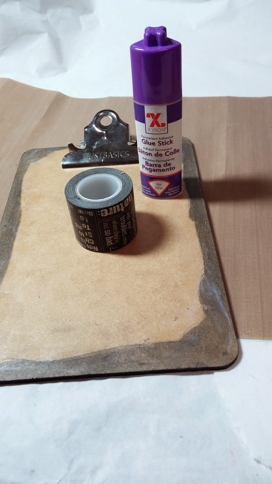
Supplies:
Washi Tape Set
Distress Stain, Black Soot
Clip board blank
Xyron Glue Stick For Corners
Xyron 1/2" Double-Sided High Tack Tape
Petaloo Flowers
Embellishments and Charms


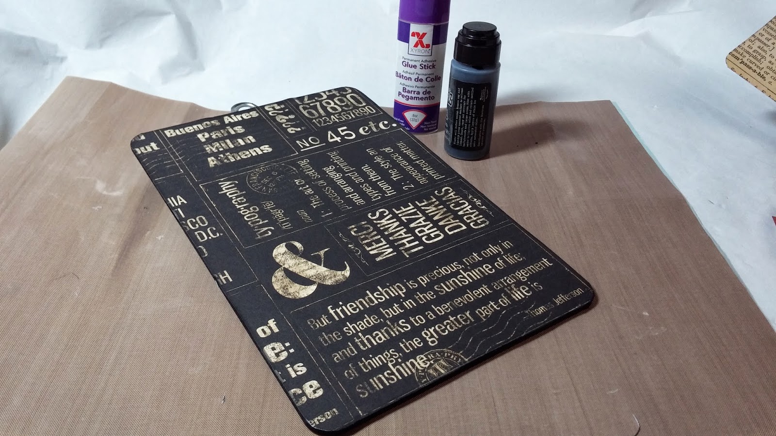
I used stain along the edges of the clip board so that there would be cohesiveness with the intended color palate.  Since I was planning to cover the rest of the board, I only did what I needed too.  


After tracing the backing for the board, I connected it with the Xyron Glue Stick for Corners.  Be sure to get all the edges, and especially burnish where the brads are. 


To keep things looking finished, I added more stain after adding the paper.  It is a tiny touch, but it really makes a difference. 


On the front of the board the metal clip is in the way of easily attaching paper.  I decided to use the new washi tape and it worked perfectly.  I did add another layer of glue.  Most washi tapes are very low tack (not all that sticky) so this extra layer of glue will ensure my edges stay down and my piece looks finished.  


I added strips of tape extending past the edges.  


Then I used small scissors to trim the edges.  I could not find my bone folder, so I used this Popsicle stick to burnish the edges.  This is important to really get everything stuck in place.  


Now I planned for my focal and chose a few layers of mattes.  I used the high tack tape to adhere them.  


Here you can see my base, all set for embellishing.  Now I had thought about keeping it simple and only adding a few bits at the top...but knowing that I just cannot stop shopping my stash, it ended up covered in all kinds of junk.  


Now I had thought about keeping it simple and only adding a few bits at the top...but knowing that I just cannot stop shopping my stash, it ended up covered in all kinds of junk!


I thought this was the perfect spot for my big feather embellishment.


I love the use of gilders paste to make the letters stand out on these embellishments.


I hope you enjoyed today's post!

Cheers, 

Rhea


Sunday, March 2, 2014

Graphic 45 Design Team 2014 Audition


It is hard to believe it has been a year since my first art dream came true and I landed a coveted slot on the highly esteemed Graphic 45 design team.  The journey has been spectacular, but I am not quite ready for it to end.  I am going to apply again and hope that I can continue to be a brand ambassador for this amazing company and serve a second term


First off I am going to show off my recently published Steampunk Mail piece.  Here I used one of my favorite lines,  Steampunk Spells, to make this little treasure.  There are also metal staples incorporated as well.


Inside this tiny mail sorter is all sorts of fun postal themed ephemera.  I used lots of distress techniques along with embossing to create lots of texture and an aged look.  


Yet another project made with the delightful Steampunk Spells paper was this fun piece of home decor made with Xyron and more Petaloo.


I adore all the metal elements and texture.


The fact that I could emboss this butterfly to match my theme was a perfect touch.  Notice the use of lots more Staples.  Graphic 45 seriously spoiled us with the hugest bag of metal stuff in our first design team kit. I remember shaking with joy as I made this discovery.  You can see that video here.


Next up I want to show off my favorite shadow box created this year, featuring Typography.  Those of you who follow me know that I adore making these easy assemblages.  They really appeal to all the crazy embellishing I like to do on my projects.


What I really enjoy about this paper line is all the great creative quotes and sayings that are included in the snippets. Finding ways to make my projects very thoughtful and unique is important to me.


A little nod to the company name.  I was amazed to find that little G on an old pen nib scored at an estate sale.


I even took the typing theme to the next level by adding a few bits of actual typewriters.  The gear and rollers above still move, and I love that.


A few more detail shots so you can see what I have stashed inside.  Lots of old vintage junk, right along side newly made embellishments, but they blend seamlessly together.


Another project done in Typography that I just adored is this cute Inspiration box.  My favorite element of this project has to be the clever use of ornate key holes for feet. 


All the lovely ribbon was sent to us in our initial Graphic 45 package from product partner, May Arts Ribbon.


I was surprised at how much I fell in love with this project using Sweet Sentiments.  This is not my usual color palate or style, but I absolutely love how it turned out, super sweet and romantic.  


All the dimension created from sewing the hearts together really makes this project special.


The clever trick of dying ribbons to match the vintage look, also helped to add those extra details.


Yet another project that is not my typical style is this up cycled box I created with Bohemian Bazaar.  The rich colors of this line reminds me of the tropics, a place most of us in the Midwest would rather be after a most challenging winter!  Both of these projects highlight how I am able to extend my typical style to encompass new directions and still produce quality work.  


The box itself matched the paper so I left the hot pink edges exposed.  The lime green ribbon was also existing to the box and worked perfectly.  You can check out the entire tutorial if you choose here.


I predict that the Botanical Tea line is going to be one of the most popular releases Graphic 45 has to date. The colors are perfect and the theme of the paper is so spot on, again, making me long for spring.


I have a few other projects from this line up my sleeve, but they are still top secret! Stay tuned this month to see what I have made and in the meantime, you can take a peek to see what is inside this easel book.


Inside I did several two page layouts, adding lots of flowers and embellishments that fit with the natural theme.


I love all the Petaloo flowers I was able to incorporate.  It almost looks as if they are real flowers pressed in the book.


Isn't it amazing the range of colors you can choose from the same package of paper.  By simply choosing coordinating versus contrasting papers, a whole different look can be achieved.


Well, that was a fun peek at my work over the past year in partnership with Graphic 45.  I can only hope the team was pleased enough with my work to invite me aboard once again.  Stay tuned to see how that all plays out!  

P.S. If your the crafty type, think about giving it a go and applying yourself, you just never know what will happen.  

Cheers, 

Rhea

Monday, January 6, 2014

Favorite project from 2013: Typography Tray


I had fully meant to do a year in review post, but somehow I never got around to it.  I was super excited to be revived into some sort of memoir post from a prompt on Natalie Kalback's 2014 Creative Jump start. The task posed to all the "jumpers" is to share their favorite project from 2013.   It was tough to narrow down, but this Typography Letterbox Tray is my pick.


This project was previously featured on Paper Crafter's Library, so it is also nice to be able to document this project in my own little corner of the blogging universe.


The focal for this piece is the lovely Typography paper by Graphic 45.  I fell in love with this paper line for sure.


I like to incorporate unique junk into my assemblage pieces to create a story.  Here you can see an old typewriter key as well as a few old pen nibs.


Lots of flowers by Petaloo were used to add lots of color and texture to this collection.


The sentiments in this paper line are just perfect for the artist.


I love this embossed butterfly, dusted in gilders paste.  I also used it in copper along the edges of the box for yummy texture.  


More junk by the way of a jack, a key, some tags and wood block accents add more unique interest.


I just love the rich palate, so unlike my usual work but I embraced it!


The typewriter metal embellishment was a perfect fit for this project.  Assemblage continues to be my favorite art form to date.


I hope you found a little bit of inspiration along the way. Thank you so much for stopping by!

Cheers, 

Rhea

Wednesday, November 20, 2013

Typograpy Letterbox Tray


I have been blessed with so many rich opportunities since joining the Graphic 45 design team and today is another one of those fantastic events.  Here is a sneak peak of my feature over on Paper Crafter's Library!


I hope you will head on over to learn more about Graphic 45 and see the rest of this project!

Cheers, 

Rhea