Friday, June 28, 2013

French Country Star Garland


As soon as I saw the challenge for the design team to create some Fourth of July decor, I knew I had to make a star garland.  I adore they symbol of the star, as my online alias shows.  


The star shapes were cut out from the French Country Patterns and Solids.  I used a template I made myself when I could not find a steel rule die at my local craft store.  My thriftiness not only saved me some money, but helped to create some interest by having some irregularity in my stars.


Eyelets were added in appropriate corners and I then simply strung my stars on the twine. I have a huge stash of vintage eyelets.  I often find big jars of eyelets at estate sales, and I cannot resist when they are fifty cents.


In order to make the metal embellishments stand out, I added another layer of paper behind them.  Edges were also inked along the way to add a bit of dimension.  The metal stars were found recently at a store closing.  While I hate to see places going out of business, I do love to get good deals.


This is where I hang my different banners.  An easy and super affordable way to seasonally dress a room.


I hope you found at least a little bit of inspiration in this project!

Cheers, 

Rhea


Sunday, June 23, 2013

Steampunk Spells Triptych


The thrill of getting my hands on new crafty stuff for my design team work never seems to wear off.  The new Steampunk Spells line by Graphic 45 has to be one of my favorite papers to date.  I feel so very blessed to start my role as a designer for a premier paper company!


The base is a triptych that Leslie is working on sourcing over at Alpha Stamps.  I will be getting a few more of these for sure once she does.  It was really simple to create a thoughtful piece.  There was a bit of a challenge for me to keep the inside flat, so that it could close.


The clasp was altered with gilders paste.  In order to thin the paste out an help it get into all the cracks of the fancy rectangular latch, a bit of mineral spirits was added. 


Inside I let the paper do most of the work.  The middle portion is not altered all that much for two reasons.  First off I had to keep it flat. Secondly, I just wanted the lovely paper to be highlighted.  I always like the "title pages" that Graphic 45 comes up with to set the tone of the line.


I am absolutely in love with this print.  Here again, it was used it in an area where it could be fully appreciated and not covered up with all my crazy embellishing.


The central portion of this piece is topped with several ornate filigree, also buffed with gilders paste. The focal piece is an old set of souvenir wings from an airline.  I added a rusted metal button and an ornate key from the Graphic 45 staples line.


I absolutely love this paper line and I can't wait to see what else I can create with it.  I am also looking forward to seeing how it looks in the hands of others!  

Cheers, 

Rhea

Saturday, June 22, 2013

Moroccan Doors


This is yet another installment of the most wonderful round robin through my Kindred Souls group.  The theme for Pam's book is ornate doors.  You should see the construction of her journal, she really inspired me!


I had some of the brand new Bohemian Bazaar paper and stickers by Graphic 45  on my work table, so these quickly became my starting point.


I just love the rich color and vibrant pattern.  I tried to hinge these doors several ways, unsuccessfully.  In order to be able to still peek inside, the problem was solved by showcasing them slightly open.


On the back I used a bit of watered down Peacock Feathers Distress stain to add watery interest.  

I hope Pam enjoys the contribution I made for her most amazing journal.

Cheers, 

Rhea


Saturday, June 15, 2013

Well Traveled Shadowbox Book


When these shadowbox books by Tim Holtz came out I knew I would absolutely have to make one.  Lucky for me, Alpha Stamps decided to carry them, so I got to create one just for them!


I love the brass frame I used to encase some random numbers.  The word "journey" was laid out with cirque alpha stickers. 


Throughout the project I used a ton of Tim's Elements Tissue Tape.  This worked really well for framing my front page out, as well as covering the edges of each little compartment. 


I went with the Well Traveled theme once again since it would compliment my selection of trinkets for the inside.


Sadly, this was the last on of my typo bulbs, they were fun while they lasted!


In these little cubbies you will find a cool brass arrow, a teeny tiny compass, and a perfect clock face to accent the theme.  The wood doors are a nice touch too, I just wish I made them with the ability to open.  Instead, I popped them out a bit by adding some foam behind them to add some depth.


The bigger compass is one of my elements in this project, as I believe it represents direction and purpose.  It was altered a little with the help of silver gilders paste.


The dream placket below has been in my stash for a while.  Again, I used a bit of silver gilders paste to add some age and dimension to the piece.  The word was in a bright blue that did not go with my color palate so this addition really helped it to fit in.


In order to get the words to show up on the word band above, white gilders paste was used .  


I hope you found a bit of  inspiration in my shadowbox book!  It was really fun to do assemblage work again, as this really is my absolute favorite way to go when it comes to art. 

Cheers, 


Rhea

Thursday, June 13, 2013

Kraft Book Tutorial with Graphic 45


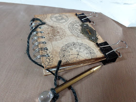
I was inspired to make this small handmade book for my dad for Father’s Day.  He is an antique dealer and he always keeps a small notebook to record what he pays for his treasures.  I thought it would be nice to make him a something with a writing utensil attached, along with pockets inside to add price tags or receipts.  


As I completed the base of the project, I was so tempted to embellish it like crazy in my usual style, but since this was for my dad, I held back on the ribbons and charms for once. 


Supplies:
Kraft Reflections 12x12
Chip board
Score Tape
May Arts Black Twine
Metal Staples: Keyhole
Vintage Photo Distress Ink
Cinch Binding Machine and Coil
Tim Holtz Glassine Envelopes, ATC sized
Recycled Paper for inside of book (think:  old notebooks, scrap papers, graph paper, ledger paper)


I started with two pieces of chip board, 4” by 5”.  They were covered with the Kraft Reflections paper and adhered with Scor Tape.


Hint: Trim corners on a diagonal for clean edges when folding your paper over.


Once the front is covered in paper, line the inside with a paper that compliments the book. 


And the covers are complete, simple really!


Ink up the edges, this simple trick adds age and dimension.


Line up your paper for the inside of the book.  Here I chose to use an old notebook from a garage sale, along with one package of Tim Holtz Glassine Envelopes. 


Punch holes for your binding method.  I chose to use my Cinch.  I love this thing.  I do a test run before punching into my covers; this was learned the hard way.


Add your covers, envelopes and paper to the coil. 


Cinch the book to create closure. 


Plan your embellishment.  I like to get out a small array of options and audition each piece.  Often I use gilders paste to add texture and age to metals; it is a stand by in my artsy arsenal.


The pencil was added with a bit of twine.  This relic makes me think of my dad because it is a vintage pencil from my very first auction.  The lead advances when you turn the clear acrylic top and it writes really smooth. 


The binder clips helped the project to be level as the glue dried on the key hole that I added. 


I think this will be handy book for my dad to keep in his van, which is always packed with lovely treasures and ready for a thrifty adventure.  

Cheers, 

Rhea


Sunday, June 2, 2013

Steampunk Peek-a-boo Cards


I really fell in love with the Well Traveled papers, so I just had to use them in my peek-a-boo cards for Alpha Stamps.  The paper's theme lends itself to a steampunk look, and as you know, this is a genre that I really love.


Collage sheets used include:  


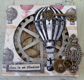
Inside I have layered lots of charms and stuff.  I fell in love with the industrial gears.  The Hot Air Balloon charm is also a perfect addition. 


On the back I tried something new!  I ran my scrapbook paper through my printer with some of Alpha Stamps new Passport Stamp Set Download.  I have to admit, I was intimidated to try these digital images, but with my simple application I was able to easily use them and it enhanced my paper.


This is my Time Card.  In this sample I was striving to use the wild new black and white paper and I still managed to go the industrial route.  I was intending for an Alice in Wonderland theme, but it just did not happen.


These die cuts proved to be so much fun to work with.   The dimension that is achieved by using them was really nice.  


Thank you so much for taking the time to stop by and leave comments, it really does mean the world to me!
Cheers, 

Rhea